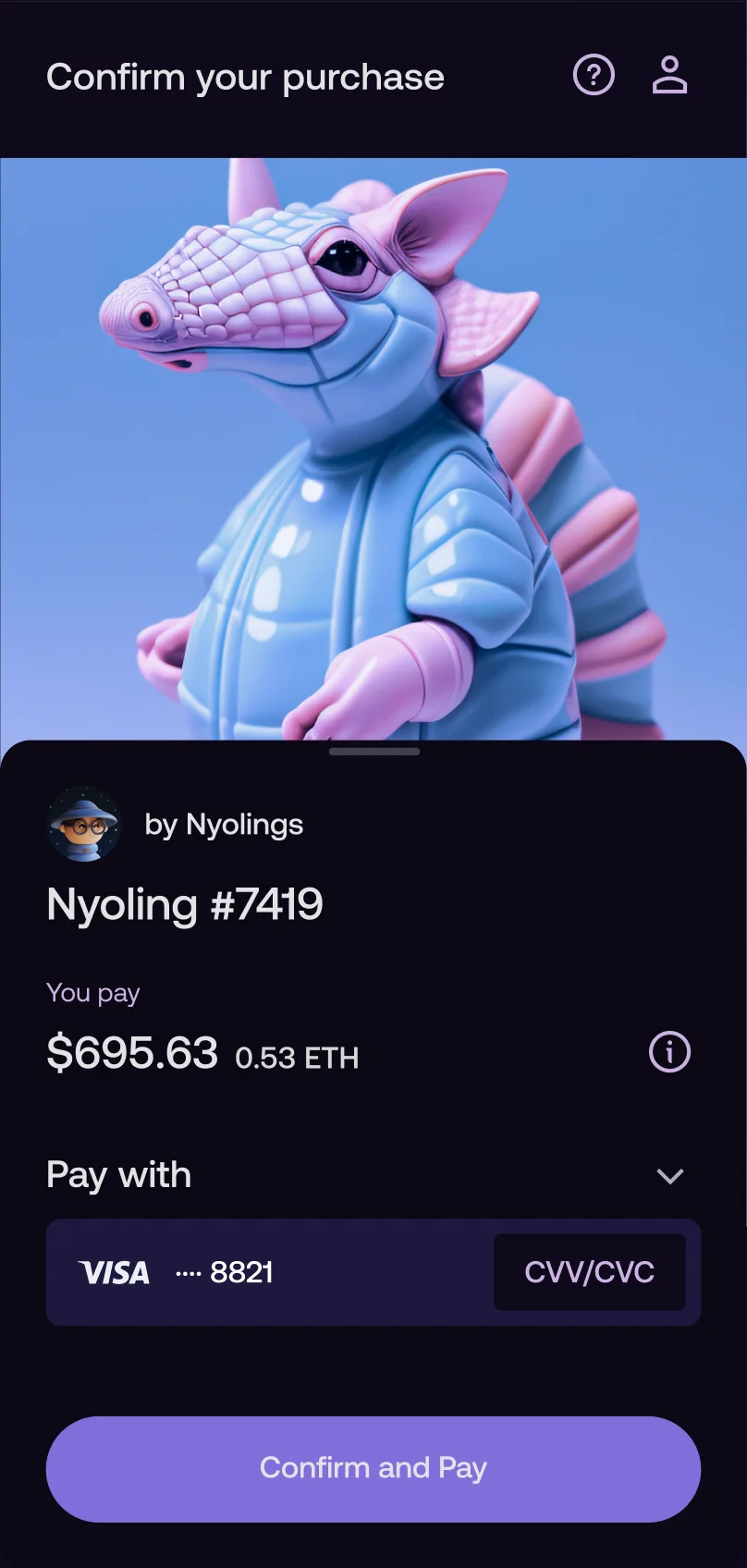
Wert is an embeddable checkout that lets partners' users buy and sell digital assets (crypto, NFTs, in-game items, etc.) inside their apps and websites. The hard part is making KYC, onboarding, and compliance feel straightforward, while supporting hundreds of partner setups that all behave differently.
I built Wert as the founding designer between 2020–2023. After occasionally consulting the team on new features, in Jan 2025 the company brought me back as Design & Product Lead. The product was scaling fast through new partnerships and needed tighter ownership to keep the experience consistent.
2025–2026WertDesign & Product Lead
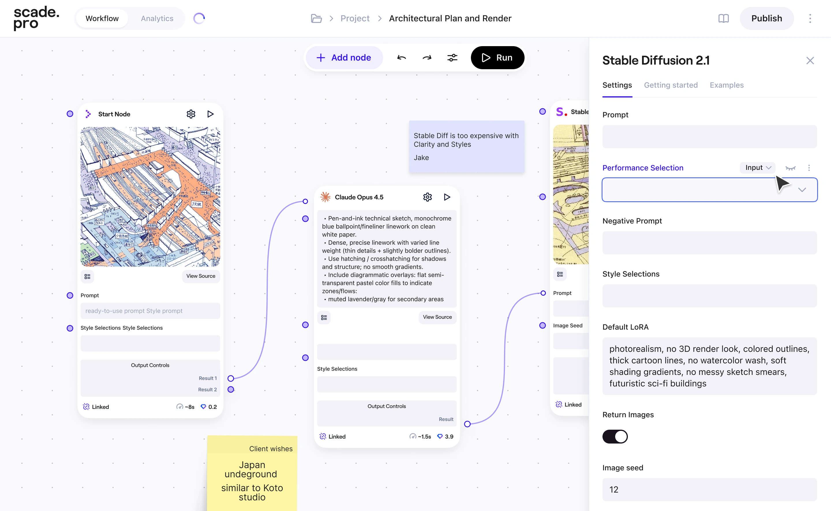
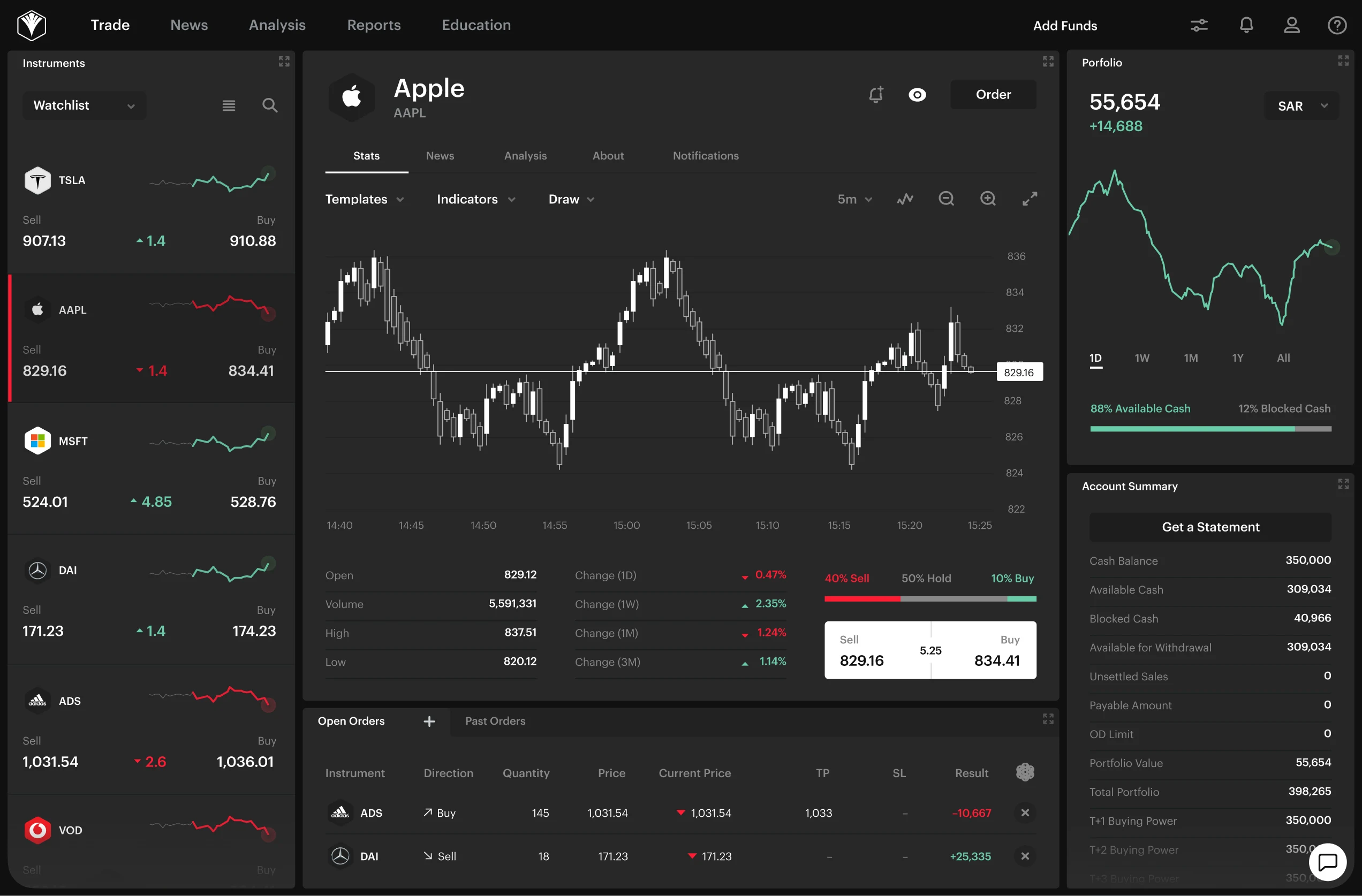
I led a cross-functional squad (Backend, two Frontend engineers, QA, Designer), set design direction for the widget and internal tools, and owned key product decisions across checkout, KYC, and partner flows.A major part of my work was identifying and fixing high-impact conversion issues that had emerged as the product scaled.
*figures are shown as relative changes; some are exact, others are quarterly medians
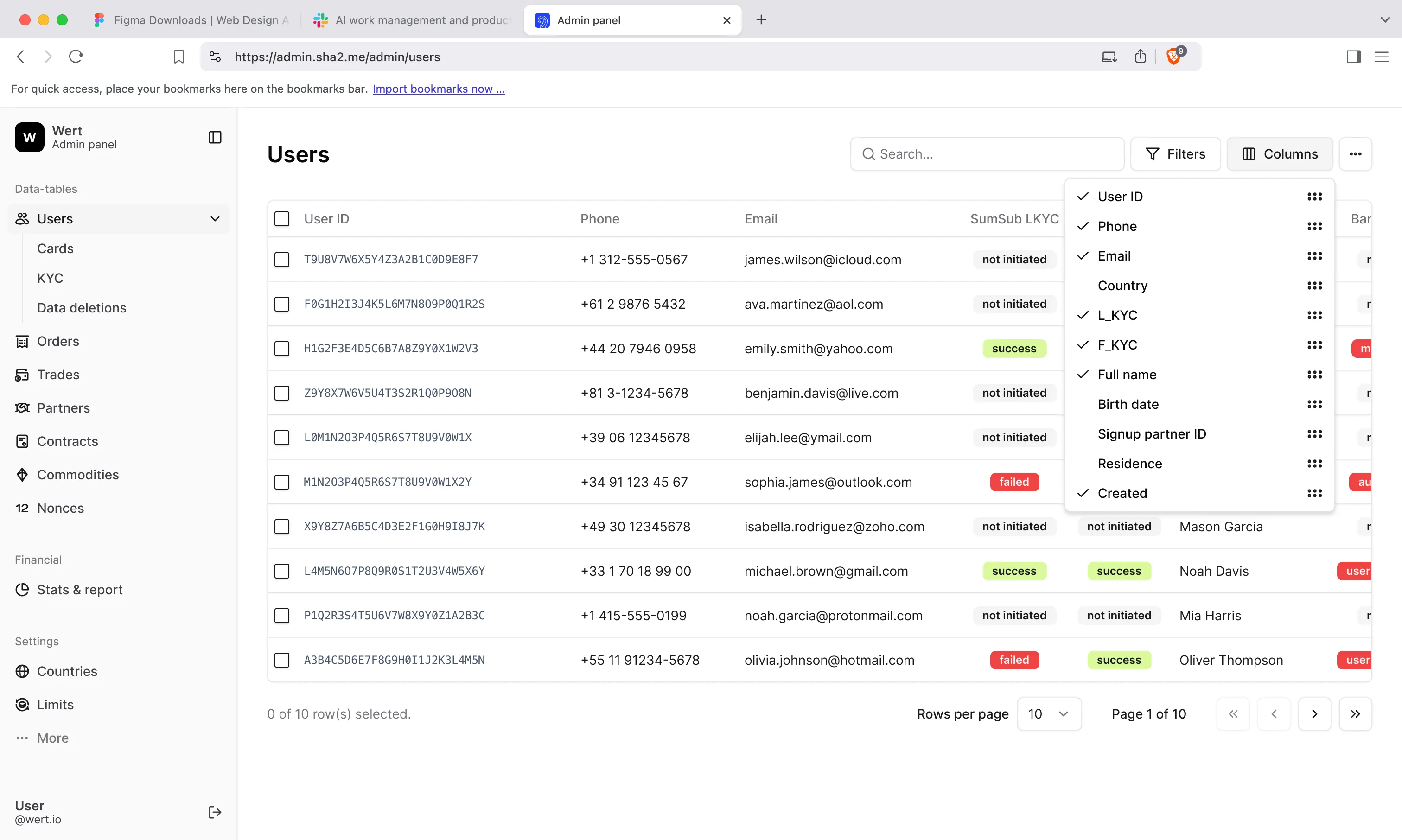
In startups, internal tools are rarely a priority. You can brute-force operations with manual work until volume makes it painful. As Wert scaled, the Admin Panel became a bottleneck. Support, Sales, and Compliance used it daily for lookups, order management, and partner configs, but it didn't reliably support those jobs. On top of that, the platform was mid-migration to a new backoffice layer, so the underlying services were changing while teams still depended on the old ones.
The goal was to keep Support fast and reliable as volume grew, without waiting for the migration to finish.
Approach
When things look broken, the temptation is to try to fix everything at once. I mapped the actual jobs the team did daily and ranked them by frequency and risk. That told us what's slowing the team most.
Quick wins built trust. We fixed the most painful flows first, the ones that forced teams to switch tools and work around bugs. That proved the work was worth it and gave the business confidence to support further improvements.
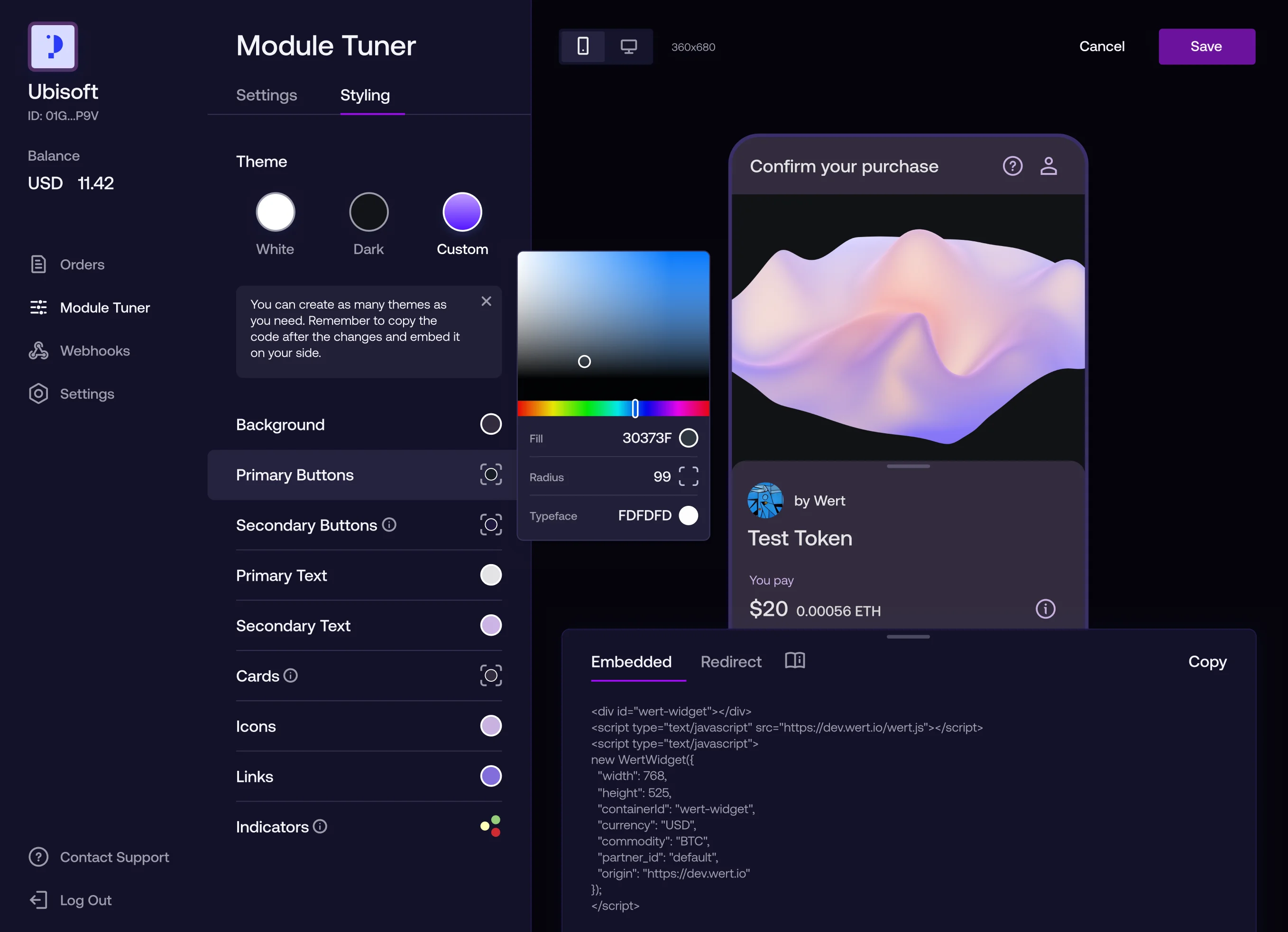
Patterns and guardrails.I set up reusable UX patterns and templates for screens, forms, and UI states. The goal was to let the team ship new and updated flows without pulling Design into every ticket.
Documentation. I captured key workflows and technical details so people could find answers without asking around.
Impact
New jobs covered by Admin Panel reduced tool-switching and manual workarounds.
Time on task dropped by 30–50% across core flows due to improved UX.
Design patterns and templates sped up future releases. The team could ship new features without reinventing the UI each time.
Kept operations stable throughout the migration, which was the hardest part.
↓ 30–50% time on task for core support actions
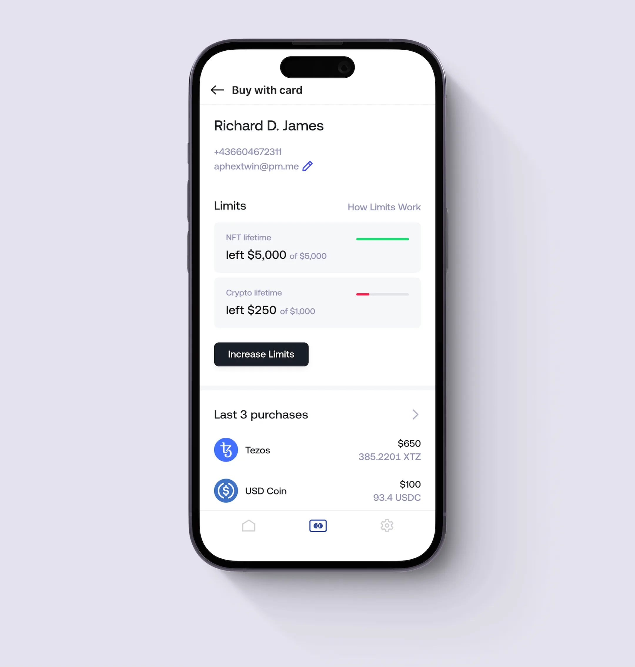
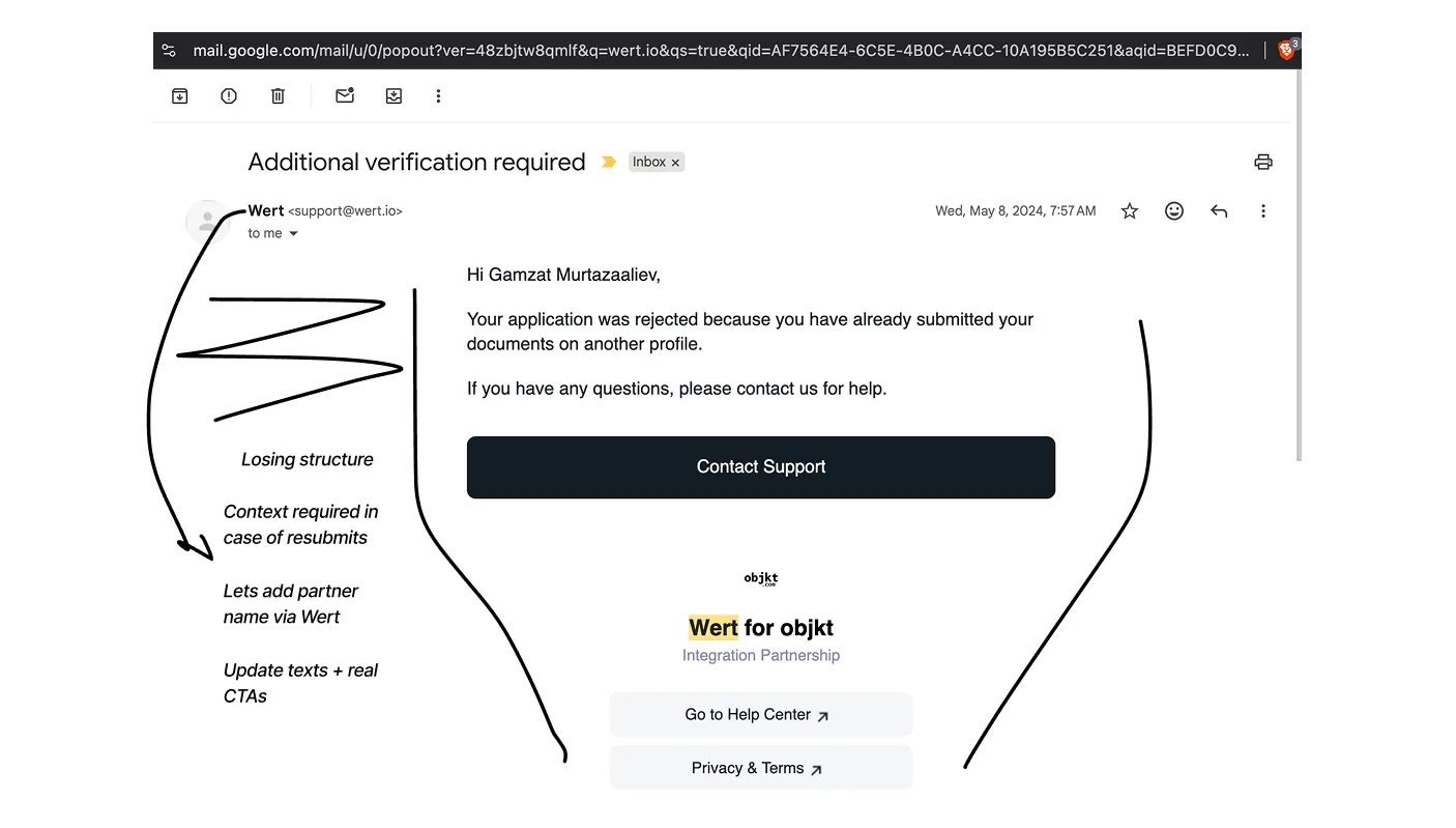
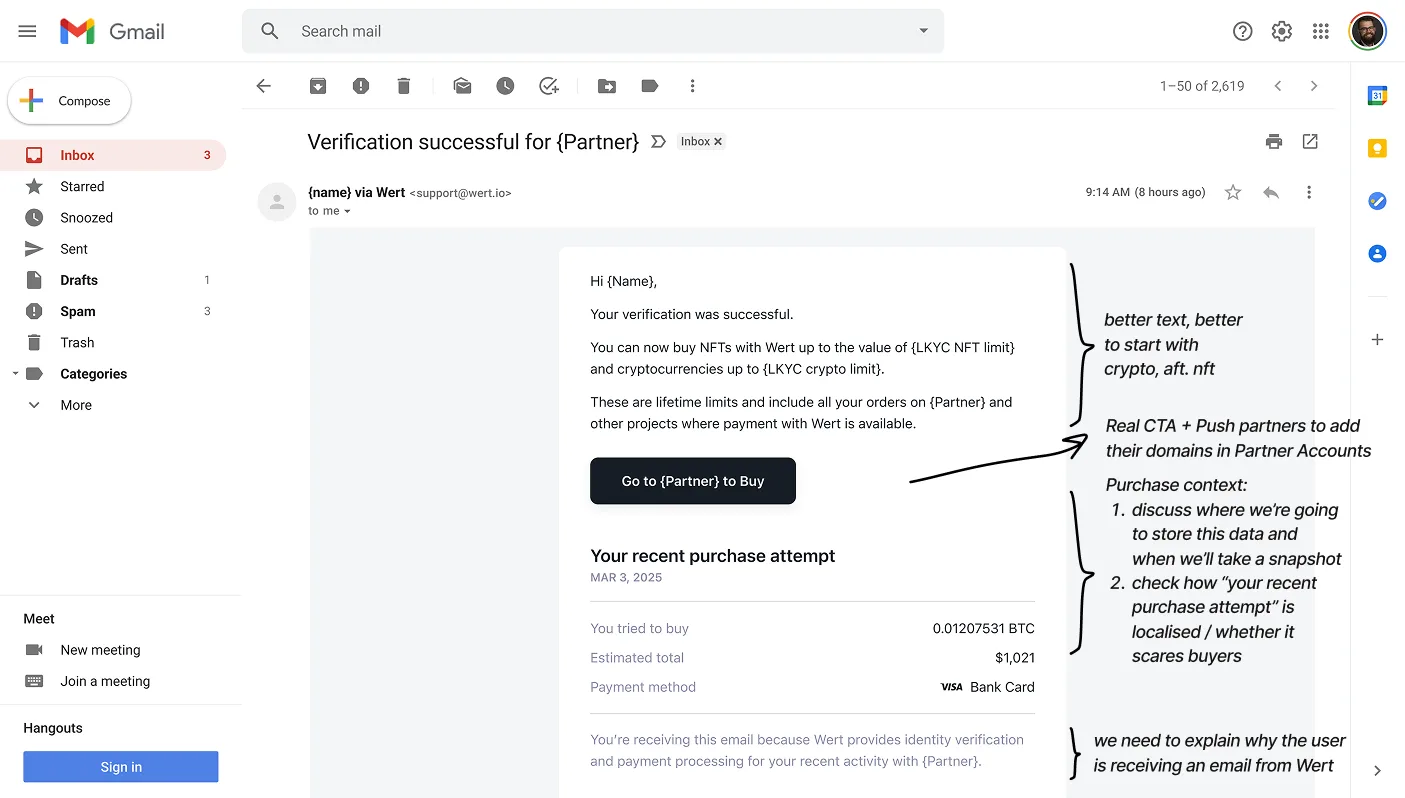
Document verification has a high failure rate across the industry — according to SumSub, up to 50% of KYC checks require resubmission (poor lighting, blurry photos, expired documents, mismatched data). Wert was no exception. Verification for larger purchases can take minutes or hours, so few stay on screen. Users rely on follow-up emails to complete the process.
After a necessary security update (details are sensitive), the email resume path broke. Users had to restart the entire purchase from the partner's website. Drop-off rose from 52% to 64% and high-value KYC recovery fell from 15% to 9%.
Approach
Always map the full journey, not just the break. Users come back hours or days later, often on a different device, with little context. Reviewing end-to-end flow showed gaps across key paths and edge cases.
Reframe the problem, make the case. Resubmission isn't try again in checkout. It's verification recovery: a separate, async journey that has to work without the original partner session. I tied it back to revenue and recovery, not just UX debt. I flagged the drop-off and aligned cross-team.
Redesign every touchpoint.I proposed separating resubmission from the main checkout flow with a standalone widget that works without an active partner session. We redesigned transactional emails for clarity and trust, added a direct resubmission link Support could share. We also added Amplitude tracking to see High-value KYC recovery rate.
Strategic overview.Each regression is a moment to recheck the fundamentals. Is the checkout flow still competitive? Is the KYC SDK still the right trade-off, or is it time to move to API integration? These are the kind of questions worth bringing to leadership.
Impact
New standalone resubmission flow. Users could now return and complete verification directly, from any channel.
Redesigned emails with clear context, step-by-step guidance, and trustworthy design.
Re-verification drop-off: 52% before → 64% after security update → 27% after release.
High-value user KYC recovery (failed → completed): ~15% before → 9% after security update → ~17% after release and held steady at ~18% median over the following quarter.
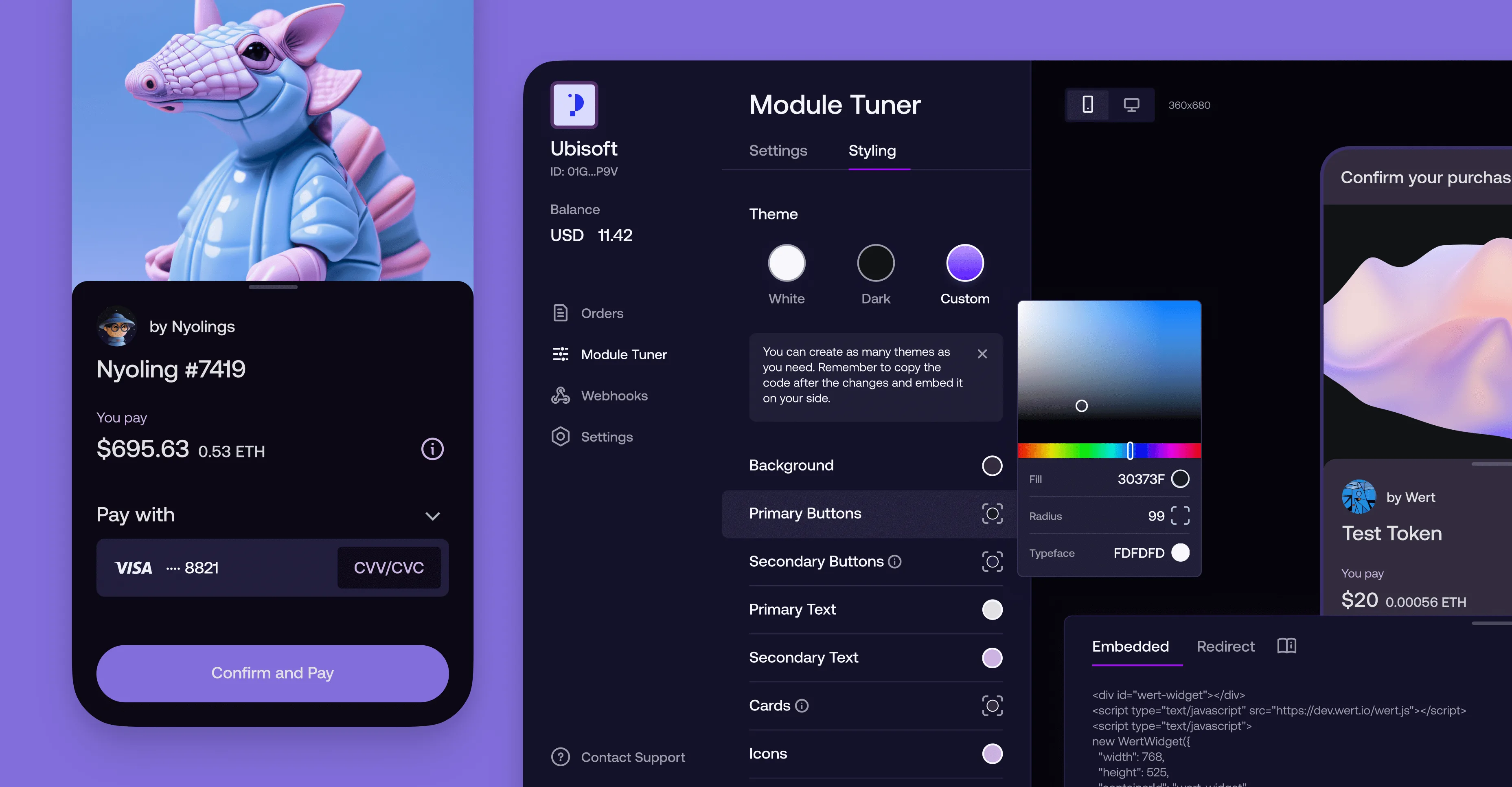
Mobile was 75%+ of traffic and converted better. But we were still running a desktop first layout I had designed years earlier. It was built to deliver a full experience across all screen sizes. It made sense at the time. It didn't anymore. Supporting it meant extra component states, more edge cases, and added complexity for a product that needed to stay small and fast. The layout was costing more than it was giving back.
Data backed it up. I led the decision to deprecate the desktop layout entirely and shift to mobile-first. Alongside that, I introduced self-contained modular components: payment method, card selection, wallet address. Each independently designable and buildable. Less coupling, less redundant work per feature, ~2× design and frontend shipping speed.
~2× design and frontend shipping speed
Buy Bitcoin
You pay
1,200USD
You get
0.05579674BTC
Purchase details
For me, this work is a snapshot of how I operate: moving from user pain to metrics, aligning priorities, and shipping changes that hold up in production.I ran the squad with distributed ownership, with team members owning features end to end while I kept a high bar for product thinking and craft.
I had the pleasure of working closely with Gamzat at Wert. He has been a core part of Wert since its foundation. As the lead designer, he shaped the user experience for our payment module and partner accounts and managed our design department effectively. His clear and consistent communication with me and the broader management team has been invaluable. I've always been impressed with how swiftly and lucidly he anticipates future design trajectories and potential challenges, guiding us towards the best solutions.
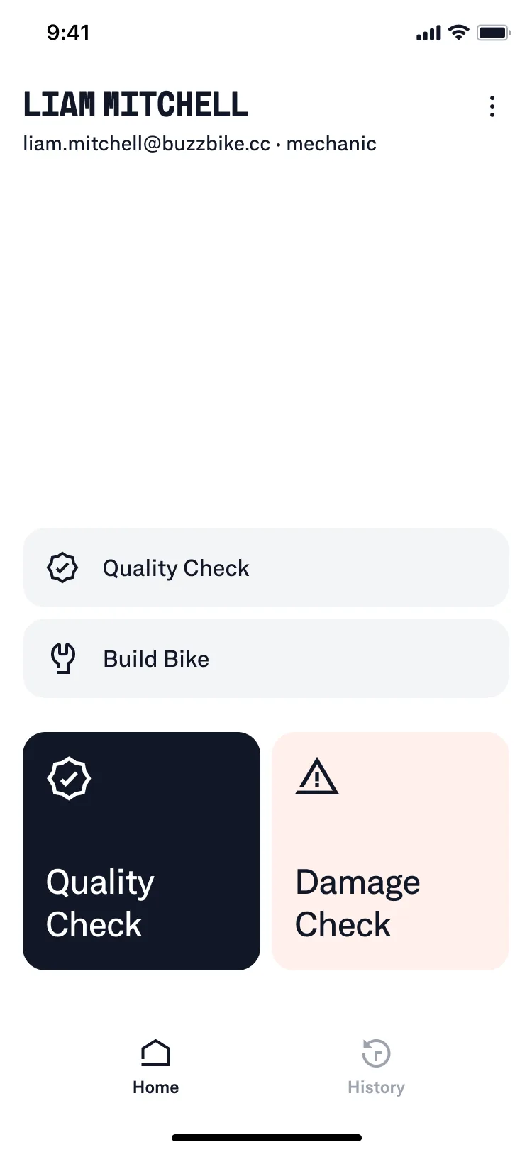
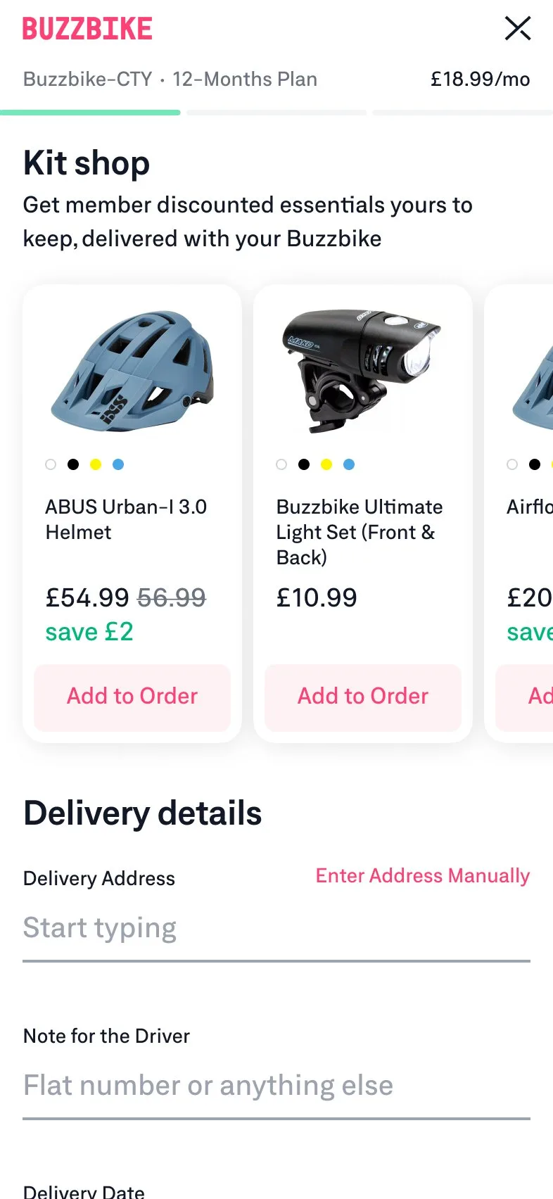
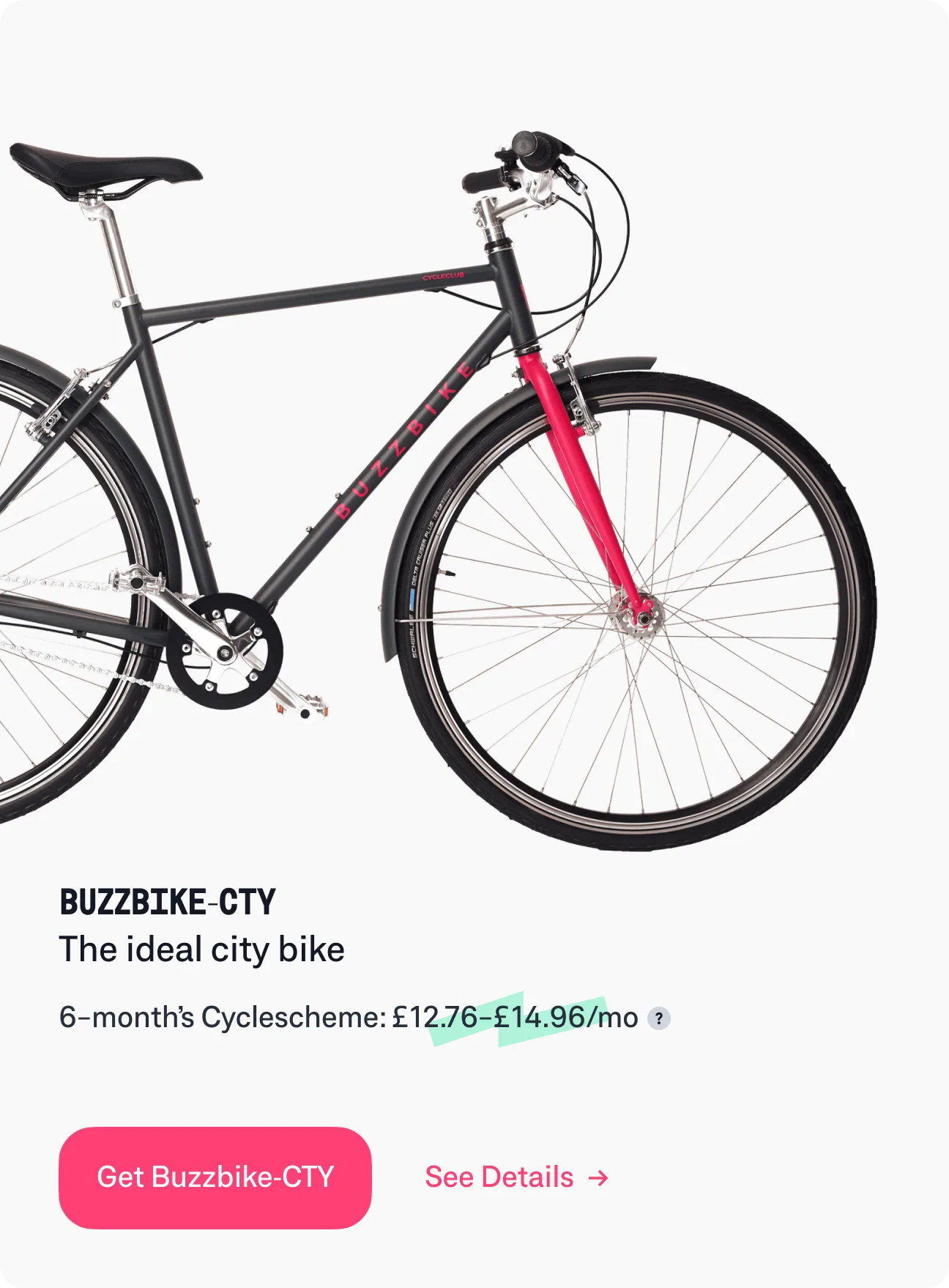
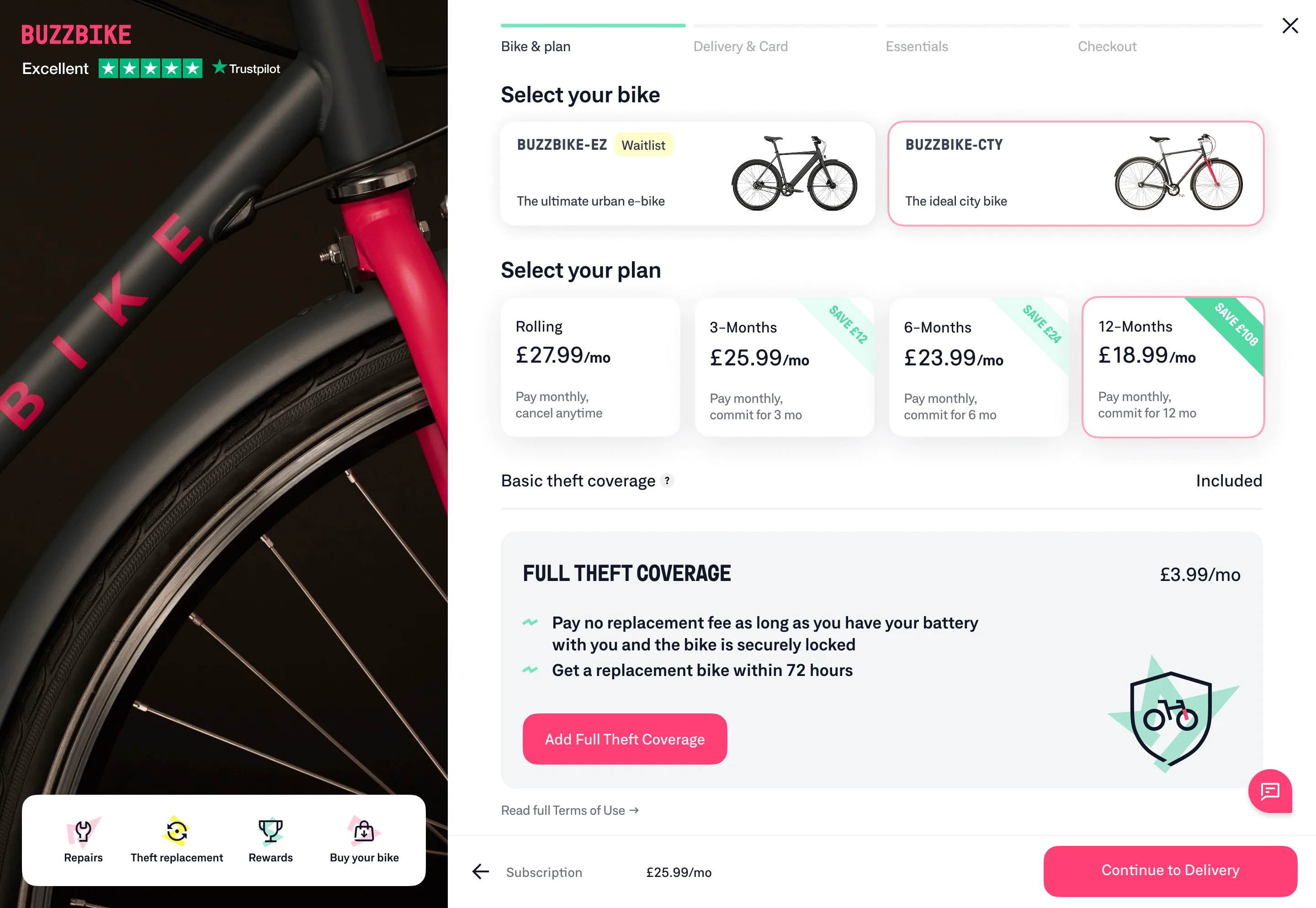
Buzzbike was a London-based bike subscription service with home delivery and on-site repairs. The challenge was designing for both sides: helping riders handle more on their own, and creating tools to improve how the ops team worked day to day.
I joined Buzzbike as Lead Designer. The product already had a strong visual identity. I helped sharpen and systematise it, and shipped clearer rider experiences and internal tools used daily by the ops team.
2023–2024BuzzbikeLead Designer
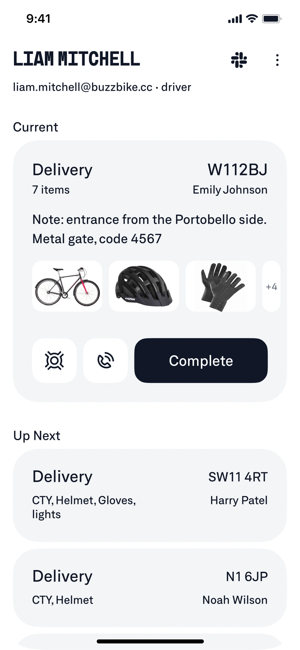
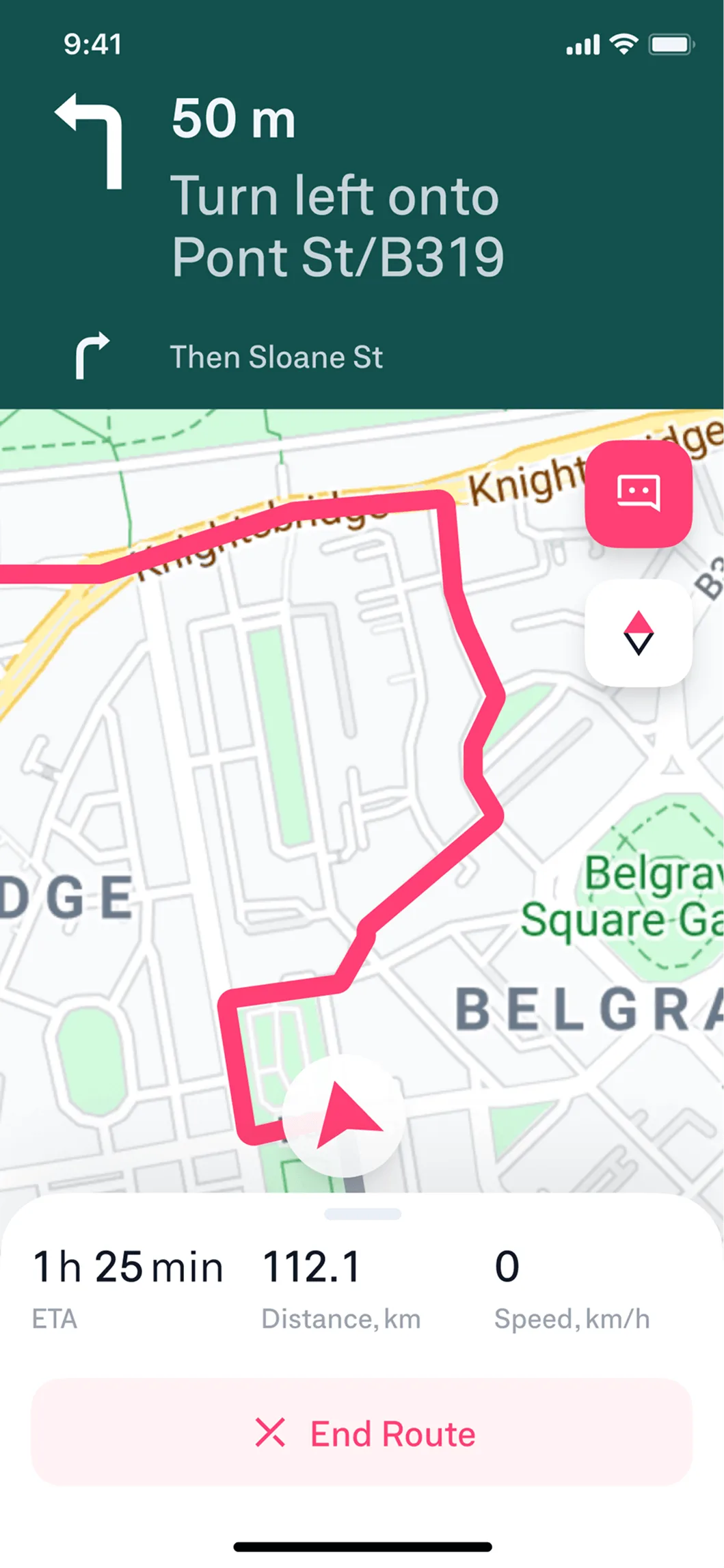
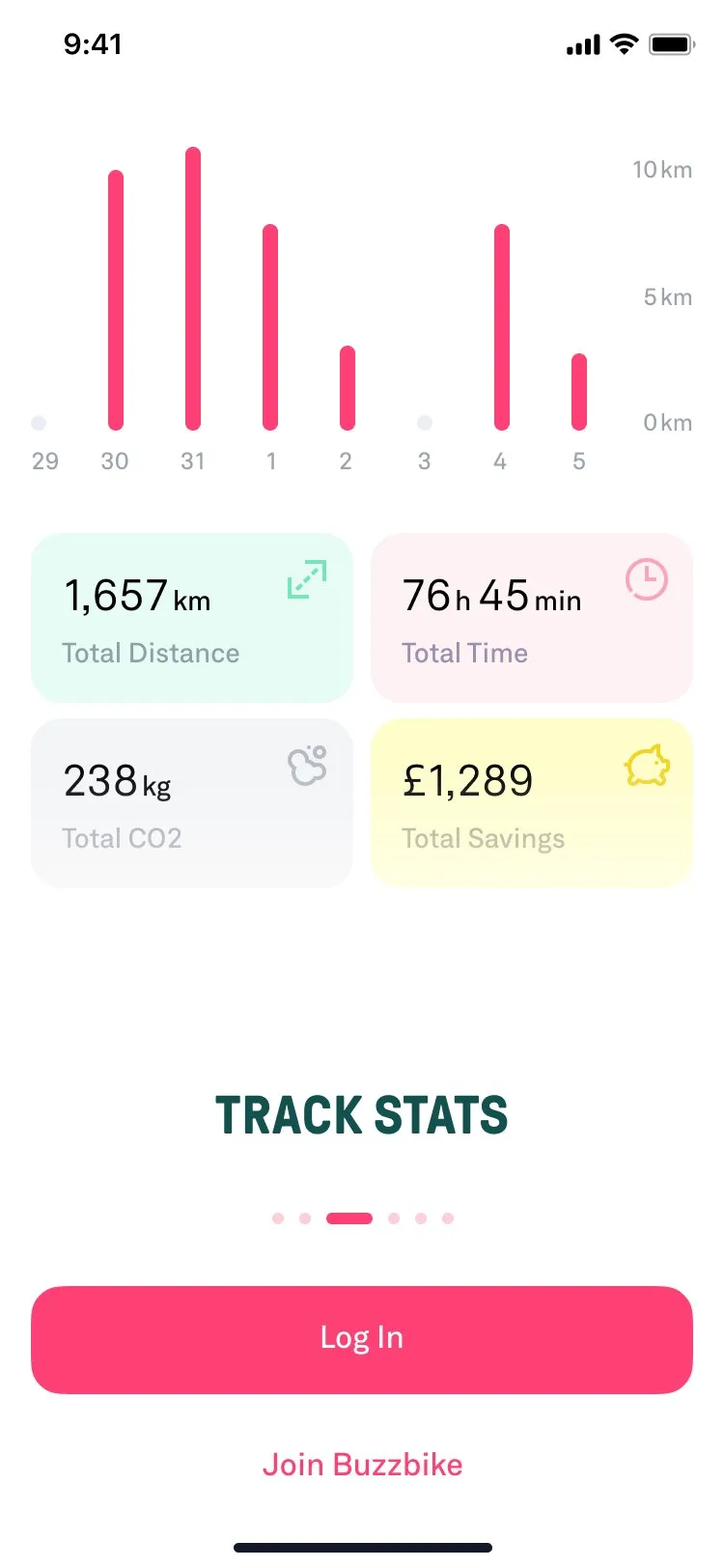
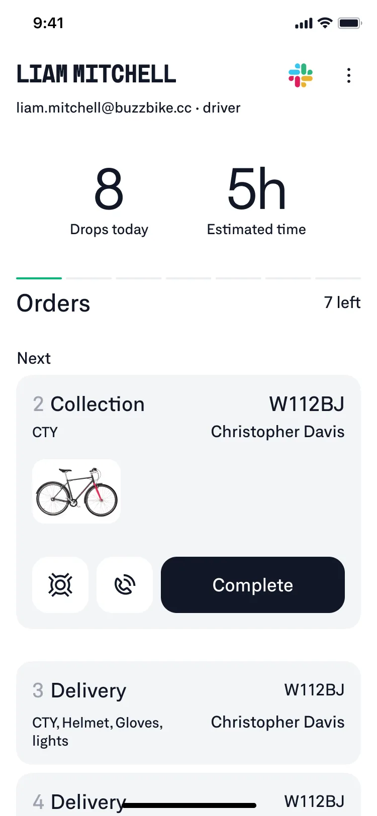
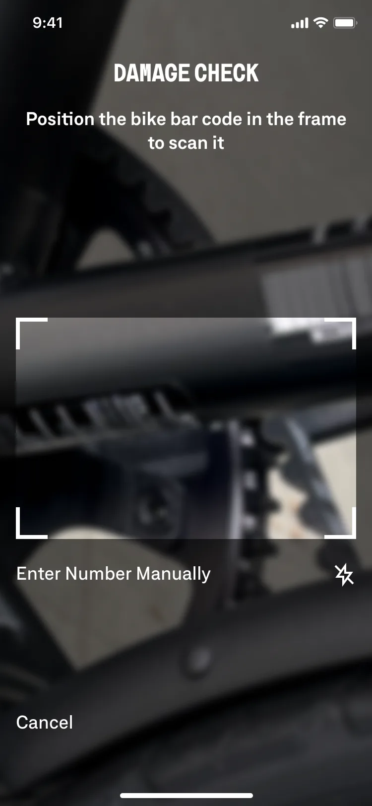
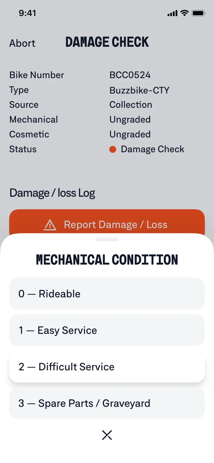
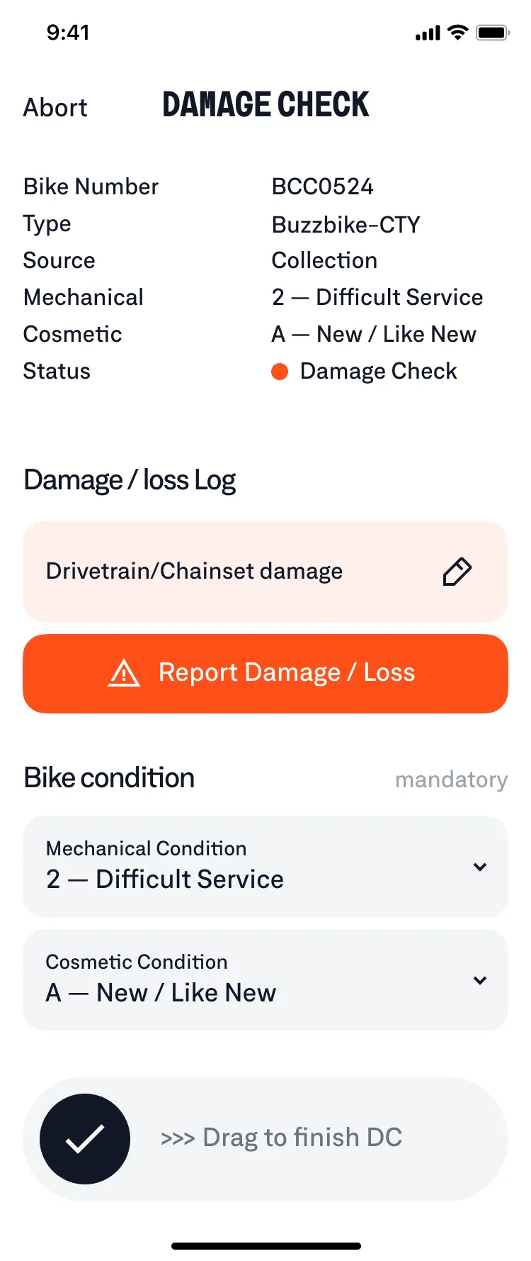
Designed the Buzzbike Ops app used by mechanics & drivers to manage fleet operations day to day
Deliveries, repairs, and warehouse work were running constantly but without proper tools. Leadership initiated an internal Ops app to make the work visible and structured.
I worked with the founders and ops leads who scoped the initiative and defined requirements, then partnered directly with mechanics and drivers to validate real workflows. I designed and tested the Ops app through prototypes and test builds, iterating on field feedback to simplify flows and surface the right context.
《 scroll to view the flow 》
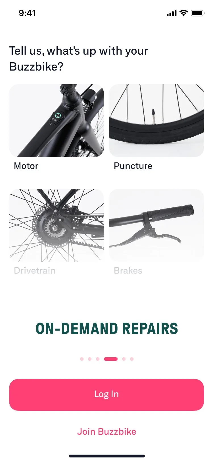
Reduced avoidable mechanic callouts by redesigning how repairs are requested in-app
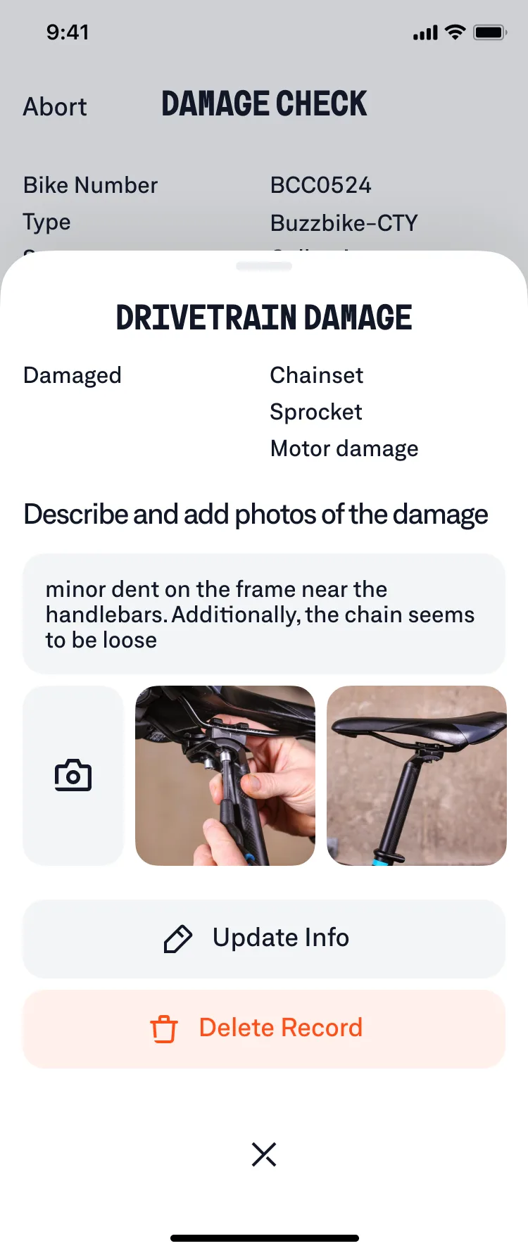
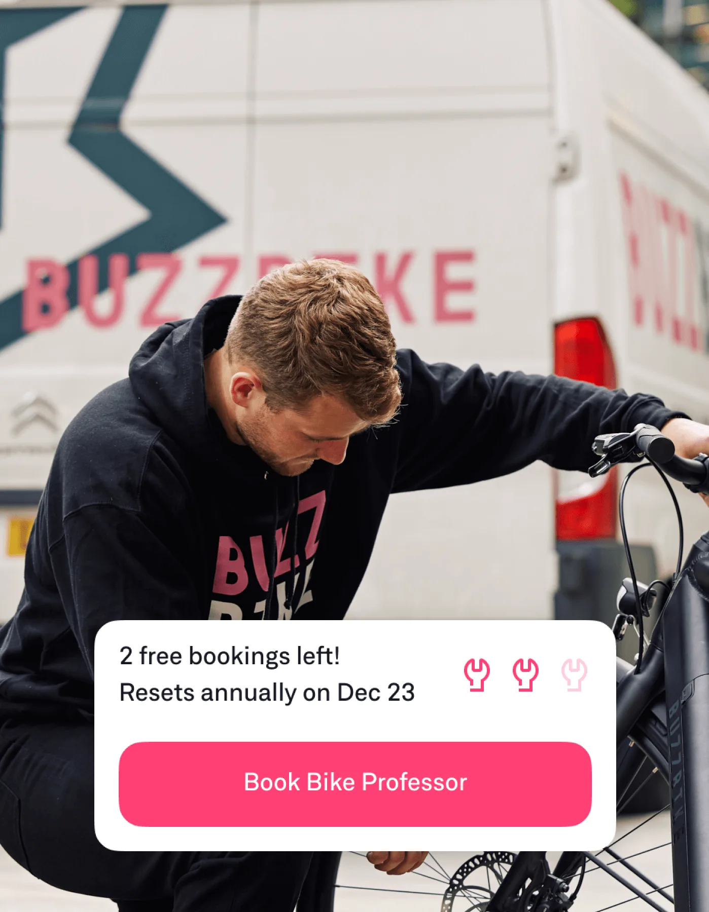
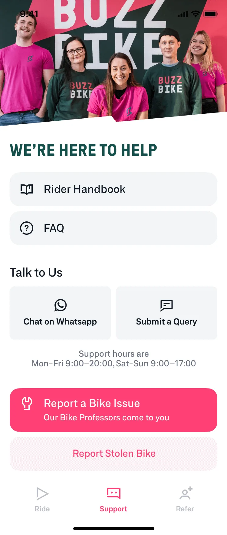
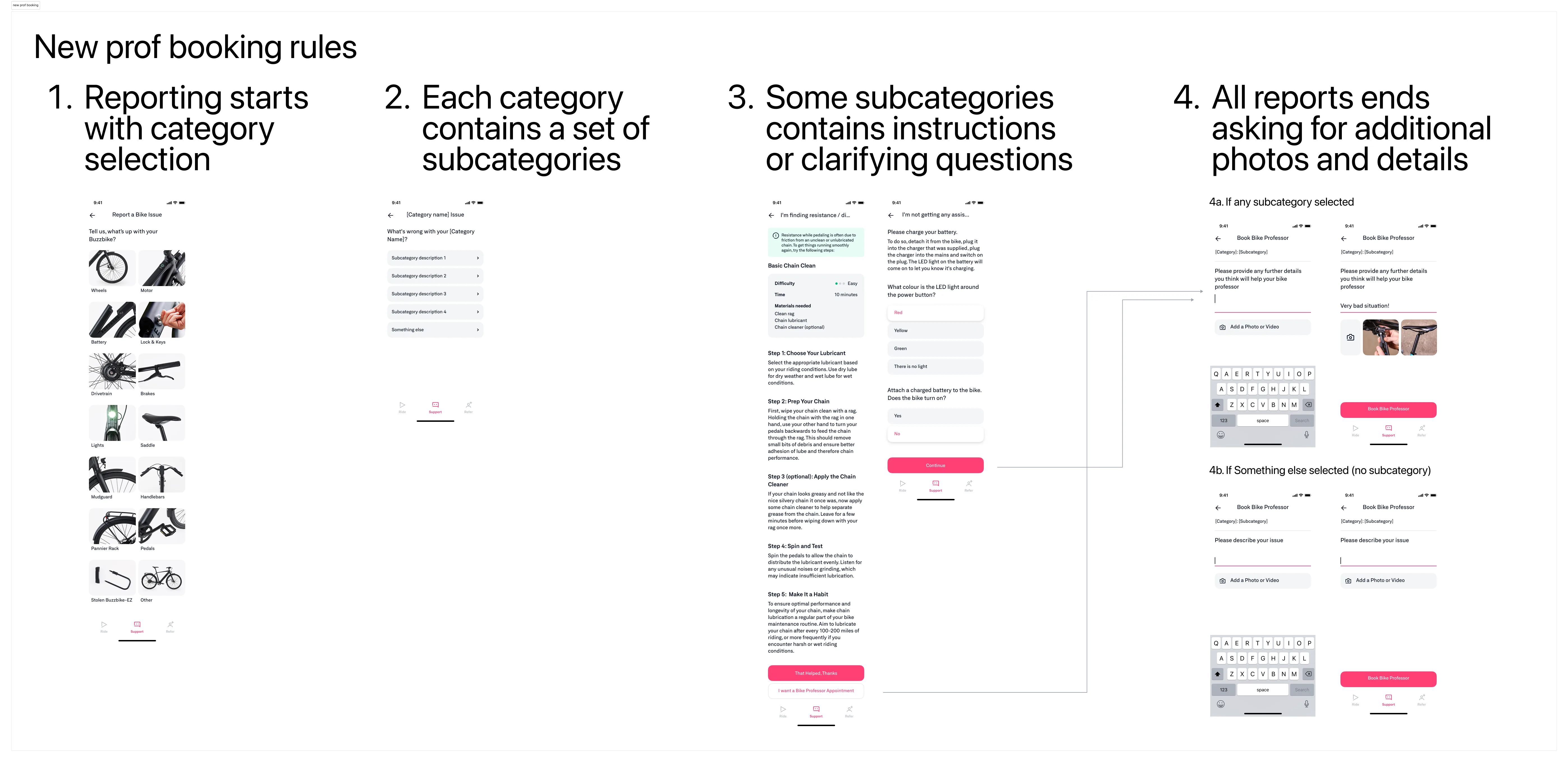
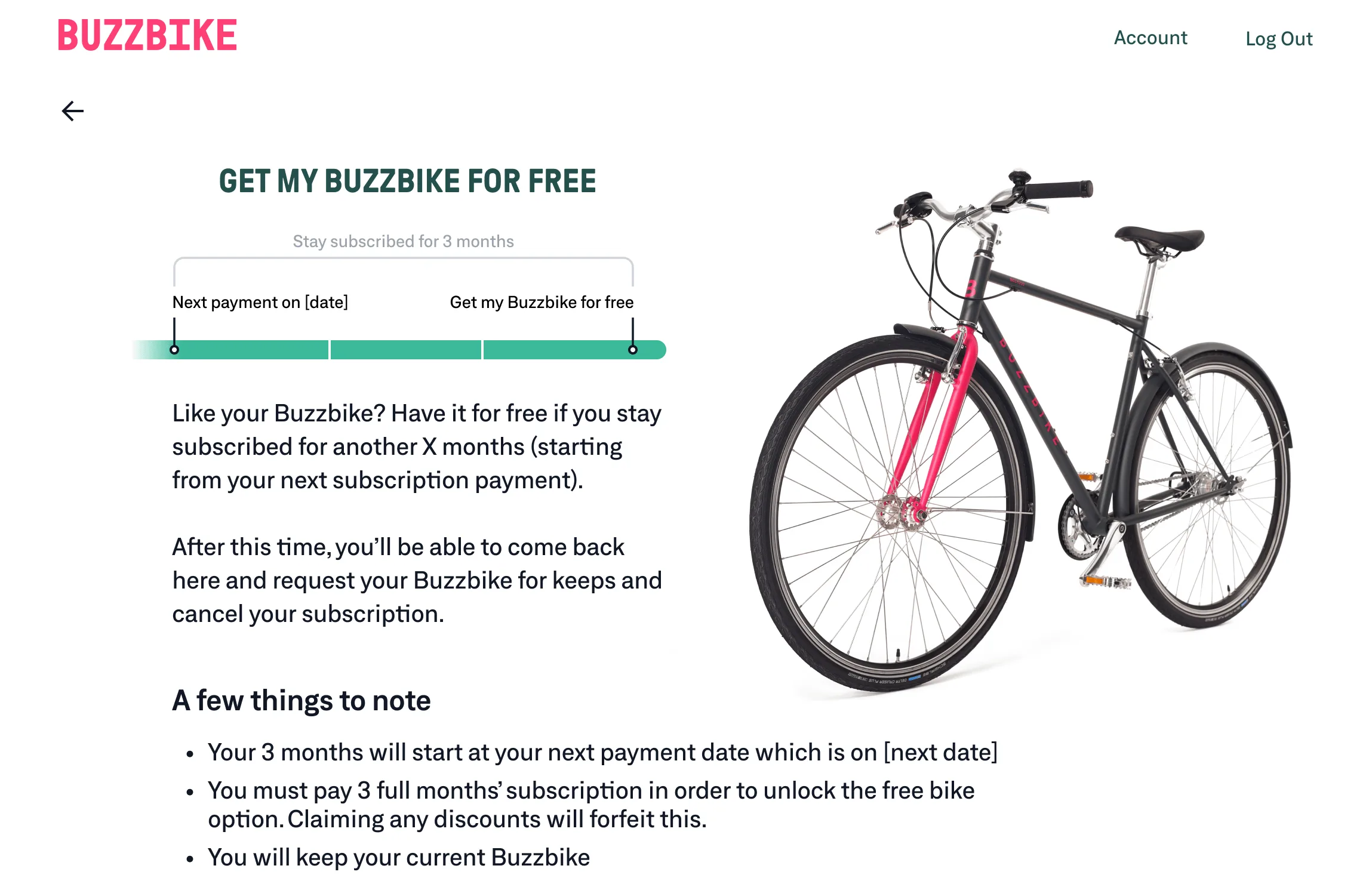
Buzzbike had unlimited free mechanic callouts and a "straight to help flow", which led to many unnecessary requests for minor issues. The business decided to cap free bookings to a fixed number per year, with additional callouts becoming paid. My task was to translate that into a flow that stayed supportive rather than feeling like a paywall.
I talked with the mechanics to understand which issues could be resolved without a visit, then redesigned how riders report problems by adding lightweight triage through clearer issue selection and follow-up questions, along with a simple decision checkpoint before booking. This led to a clear drop in unnecessary callouts while keeping mechanic support accessible.
Worked on sign-up, cancellation, and other key flows to improve conversion
I contributed across the rider-facing product, including sign-up, onboarding, cancellation, and ongoing updates to the website and mobile app. The team leaned heavily on A/B testing to guide decisions, but with relatively low traffic I was careful not to treat results as definitive. I pushed for a more balanced approach, using experiments as signals while relying on product judgment and UX reasoning to help the team decide what was worth shipping and scaling.
Design Strategy While Searching for Product-Market Fit
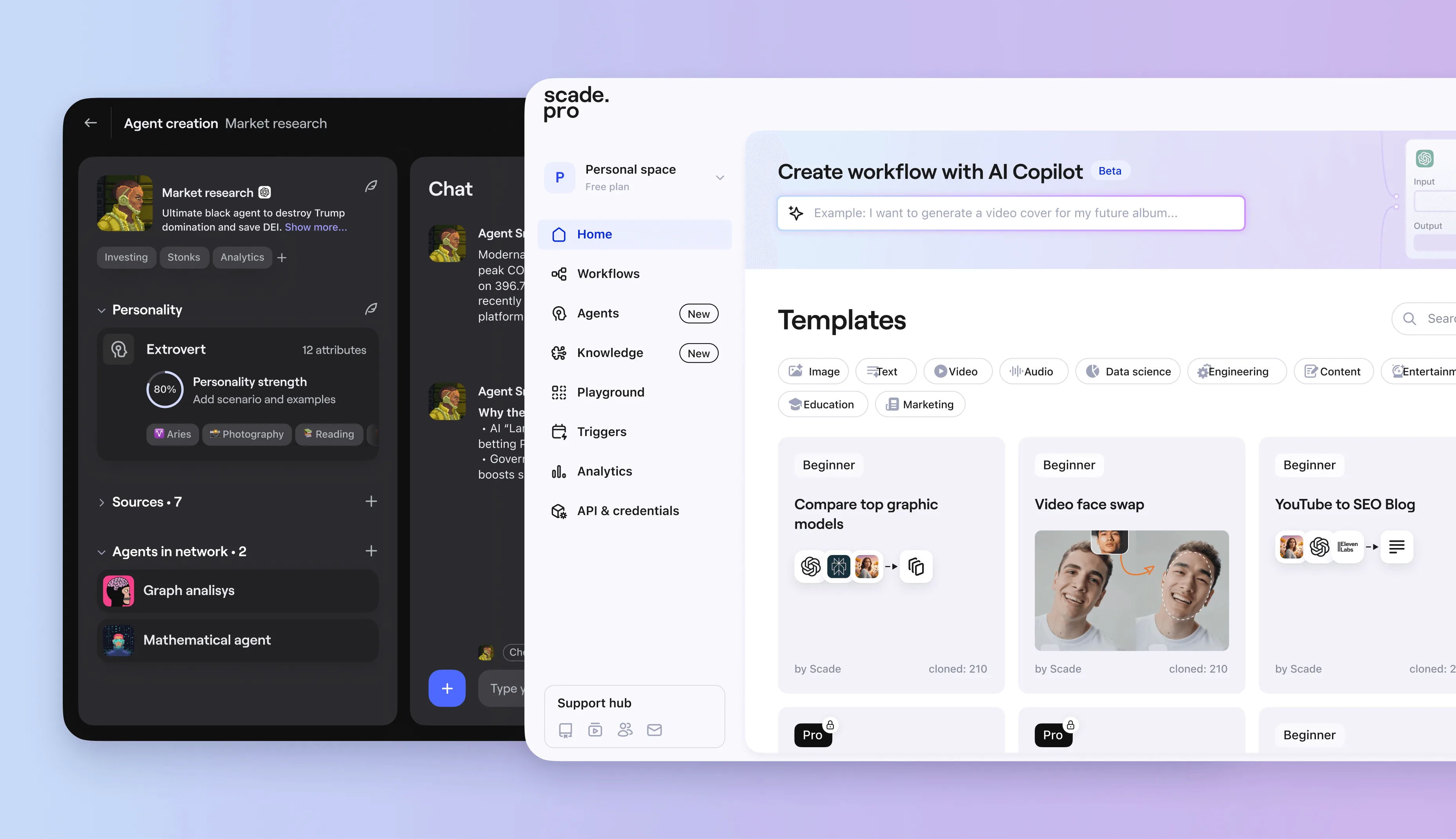
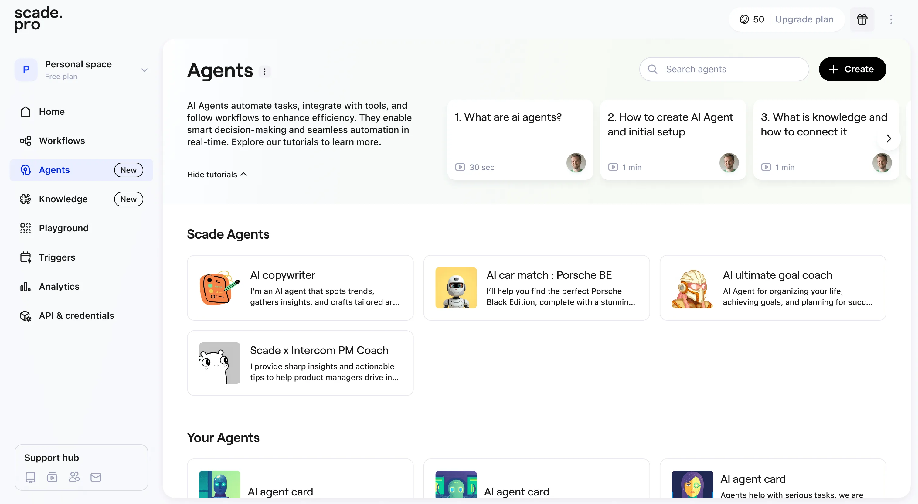
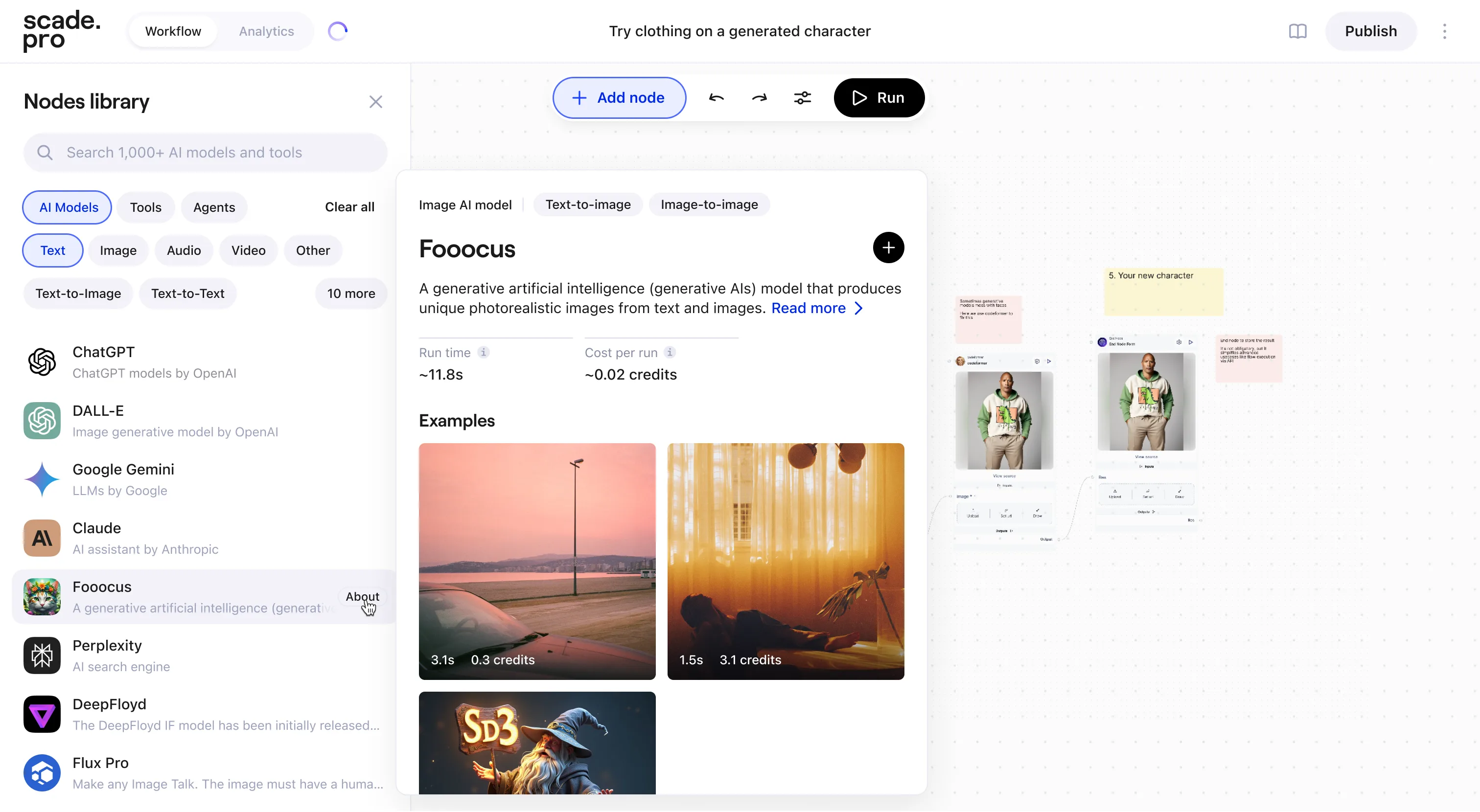
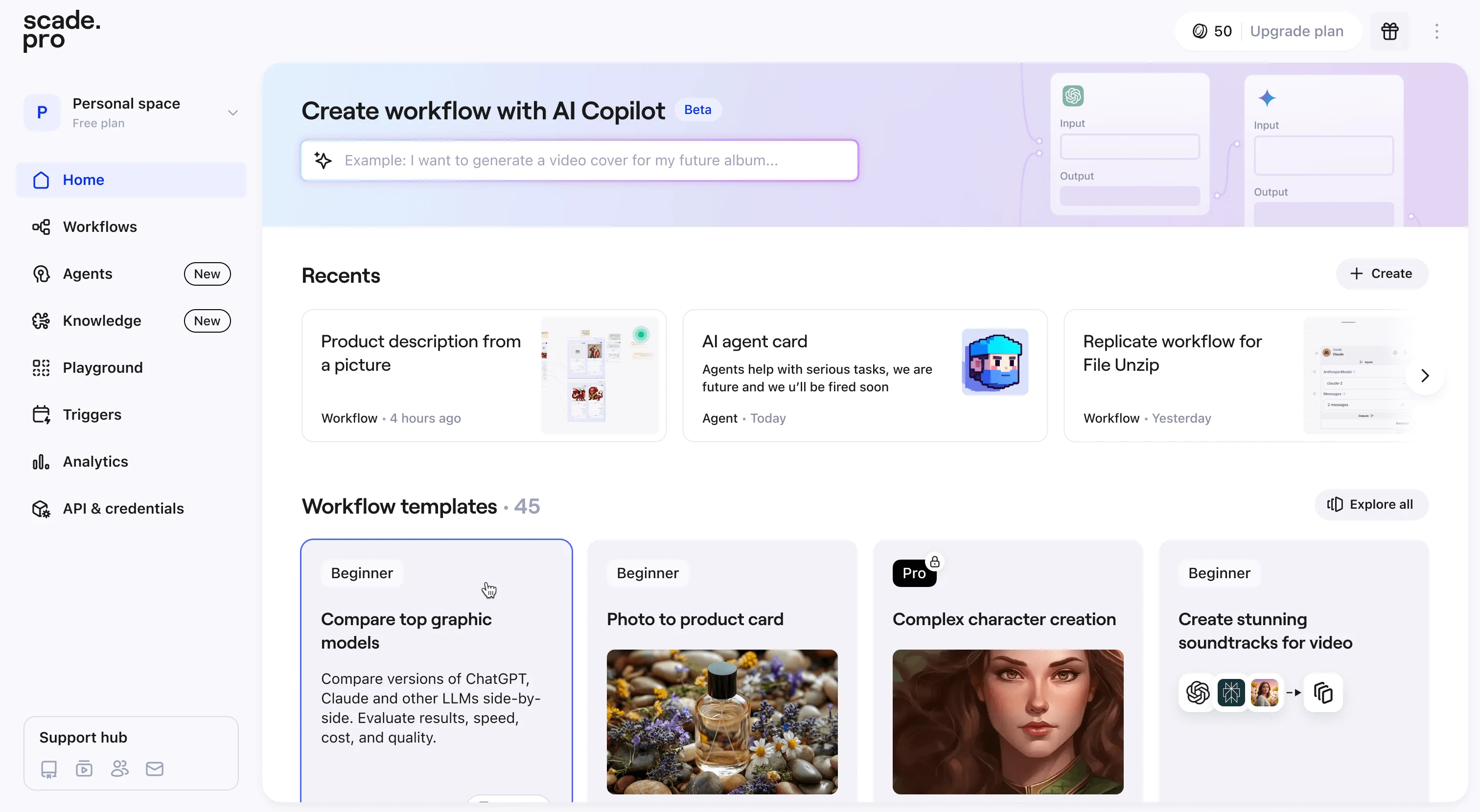
Scade is a no-code platform for building AI workflows. Canvas-based editor for combining AI models into automated pipelines. The product is live, with founders exploring its next direction.
In 2024, no-code AI platforms were everywhere. Zapier, Make, and n8n were adding AI to existing user bases. New startups like Gumloop, Relevance AI, and dozens more were launching monthly. Startups were figuring out what to build, businesses were figuring out where AI fits in, users were still learning what it can do.
2024–2025ScadeDesign Lead
I led a design team of three: Product and Web Designers and an Illustrator. Worked hands-on across product decisions, branding, and core flows. The main challenge was knowing where design effort matters most when the company is still looking for product market fit.
Issue one: knowing where design effort matters most. When the company is still searching for product market fit, every design decision is a bet. Do you optimise the core product for power users, or fix the top of the funnel to bring more people in? Do you invest in consistency, or run experiments? The market is moving fast, resources are limited, and there's no validated answer yet.
Issue two: catching up on design quality. The product was inconsistent and failed at basic UX due to lack of design expertise in the team. The founders recognised this and brought me in to close the gap. When design starts late, the gap compounds. Every feature shipped without design thinking adds to the debt, and closing that gap while also pushing forward is a challenge.
These two compete for the same time. Design debt is tangible work with visible progress. It's easy to fully lean towards it. Funnel and growth work is structurally different. If marketing is driving traffic, you can test fast, but with an early-stage product and low volume, even a simple A/B test needs weeks and thousands of visitors to tell you anything reliable. And you're running experiments on a user base you're still researching in parallel (custdevs, session recordings, interviews). Better to fix design debt where it matters for the funnel, and experiment everywhere else. You don't need perfect data to start. Even relative improvements in the flows you've touched are enough to know you're pointing in the right direction.
Landing
Sign up
Activated
Retained
Start from the top of the funnel. The logic follows the AARRR framework (aha moment/time-to-value + retention by habit/use-case). Each stage depends on the one before it. Fixing the canvas for users who never get there doesn't move any number. And in a platform that can do almost anything, the real design challenge is progressive disclosure (NN/g): what do you show first, and how do you let complexity reveal itself as users go deeper. The marketing team backed this direction.
Don't overlook power users inside your own team. Five AI engineers were using our platform (and competitors') daily. Once we treated them as a real user group, we got some of the most valuable feedback in the project. I even took internal courses on how to use the platform to better understand the pain points firsthand.
Some of the things I focused on:
Sign-up completion, activation rate, and time to first value as the key metrics every design decision mapped back to.
Usability interviews alongside custdevs. The team was focused on discovery. I focused on usage.
Updated the design system and set a visual direction: more playful and approachable.
Fixed the sign-up flow and added social authentication. ~80% of new users chose social, and completion improved by ~15% (with broader changes, e.g. sign-up modal over the 'live' platform instead of a landing page).
Rebuilt onboarding from a skippable form into an interactive survey where users could see how the product adapts to their answers. This also worked as segmentation: we started learning which jobs-to-be-done brought people in and which ones retained.
Microsoft Clarity recordings confirmed that users engaged more thoroughly when they saw meaningful visual feedback.
The onboarding flow went from broad to specific: see what's possible, tell us what you're curious about, try it now.
Clearest signal: most paying users came to automate content creation and monetise the output, and only some to explore "AI".
What I'd do differently: lean harder into experiments and faster deployment. More tests, less refinement. I spent more time than needed on the design system, brand direction, and visual consistency. It stopped the debt from compounding and helped the team ship faster afterwards, but it wasn't the thing that would answer product market fit questions. In a company still searching, speed of learning matters more. I'd balance it differently now.
Where to focus design while searching for product market fit?
Ship the feature, improve later. That's a reasonable instinct, but how much design does an MVP actually need? I believe it depends on where your product sits. If the technology is new and there's nothing like it, shipping fast and improving later makes sense. Users will tolerate rough edges for something they can't get anywhere else (ComfyUI, StableDiffusion). They won't when there are ten alternatives. A feature that works but looks unfinished loses to one that feels intentional.
At Scade, the push was often to skip design and ship features faster. I worked to keep both running together. Not everything needed full polish, but the key touchpoints, features that sell the product, needed to feel considered. When the product doesn't sell itself on technology alone, design is what earns the second session (Dia browser, Replicate, Perplexity).
How polished should an MVP design really be?
Summary
We rebuilt the visual identity and product experience in a short window, which gave marketing the freedom to experiment knowing the product wouldn't fail at the design level, and gave founders something they could confidently show to investors and customers. That push contributed to strong Product Hunt launches, and design was part of the reason. I improved top-of-funnel metrics and eventually reached the hardest part: the canvas itself. For me, it was a constant exercise in balancing design output with what actually moves the numbers.
Wert is an embeddable checkout that lets partners' users buy and sell digital assets (crypto, NFTs, in-game items, etc.) inside their apps and websites. The hard part is making KYC, onboarding, and compliance feel straightforward, while supporting hundreds of partner setups that all behave differently.
This case is from my time as Founding Designer at Wert and was written a few years ago. The work and reasoning are real, but I'd frame and prioritise the story differently today, based on how my role and perspective have evolved. Also, honestly, it's a bit of a slog to get through.
Clay is a SF-based UI/UX and branding agency that designs digital products, websites, and design systems for startups and major tech brands. The challenge was delivering polished work fast while constantly switching between clients and styles, often without full visibility into real constraints, data, and what happens after handoff.
At Clay, I worked across fintech and enterprise products. Two projects I can share: redesigning core transactional flows for DSX.UK, a crypto exchange, and designing an enterprise analytics platform for Brightfield.
2019–2020ClaySenior UX/UI Designer
I joined Clay to strengthen visual craft and raise my execution bar. I already had strong product and UX fundamentals, but I wanted to learn in a team where craft is the standard.
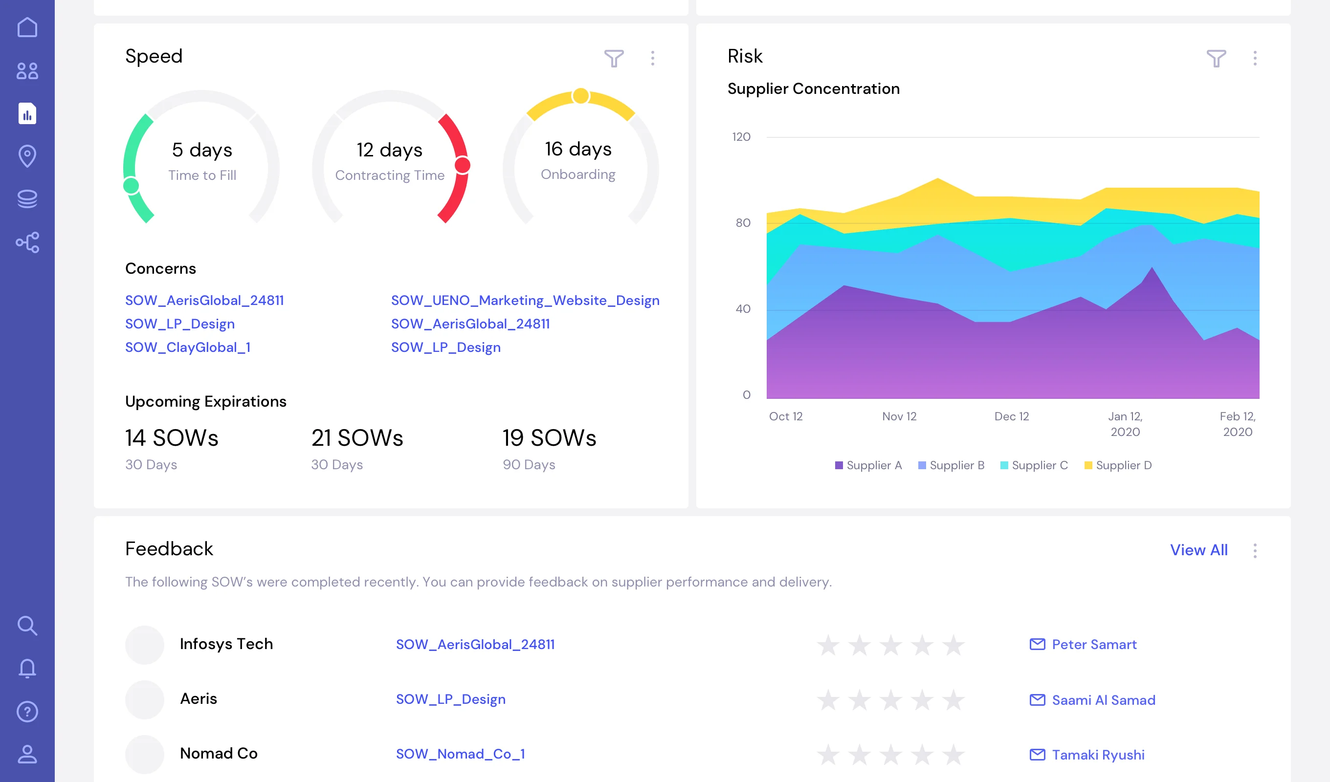
Brightfield is a workforce analytics SaaS company. Their platform, TDX (Talent Data Exchange), uses data and automation to help enterprises benchmark roles and rates, track trends, and find cost and risk opportunities across contingent labour and SOW spend.
I worked as the Senior UX/UI Designer alongside a UX Director and Art Director, defining the design language and applying it across core product flows. That included setting the visual system and interaction patterns for a dense, data-heavy interface, then designing key screens and workflows so complex information stayed consistent, readable, and usable. It became the foundation for the live product's UX and visual language.
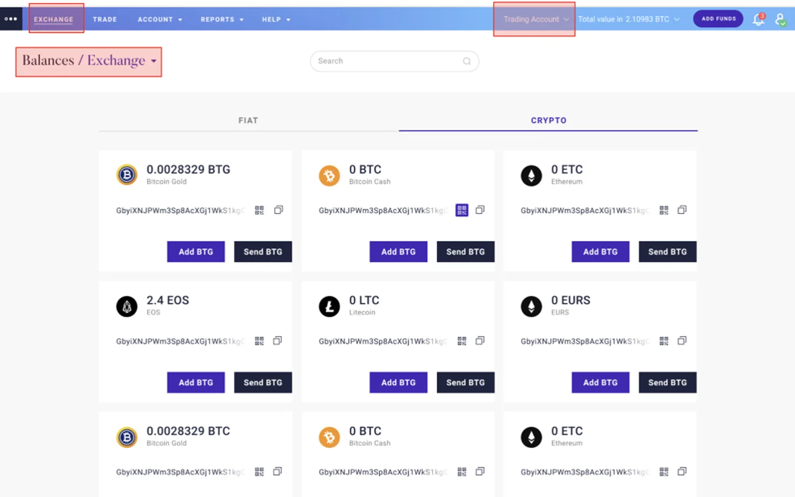
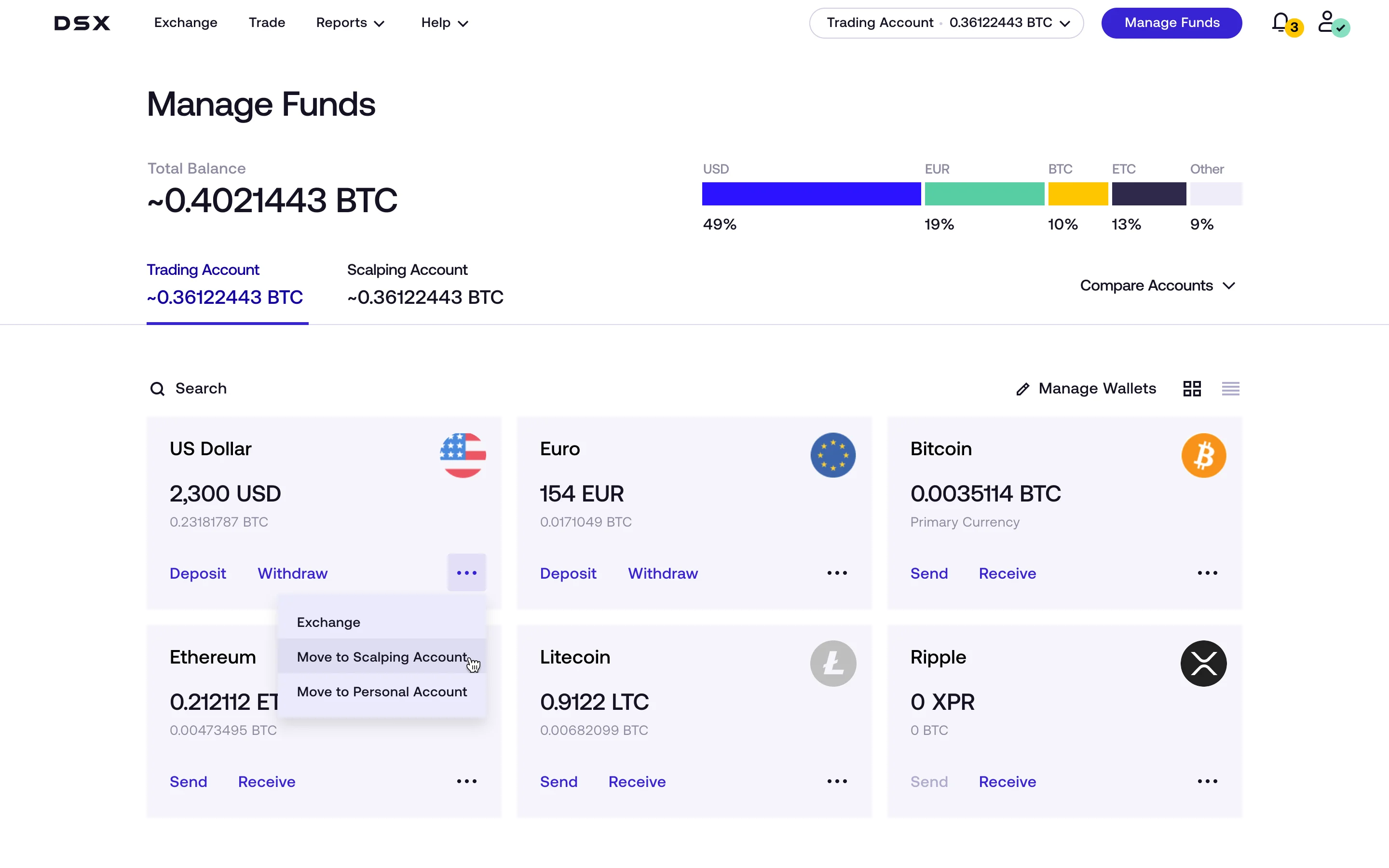
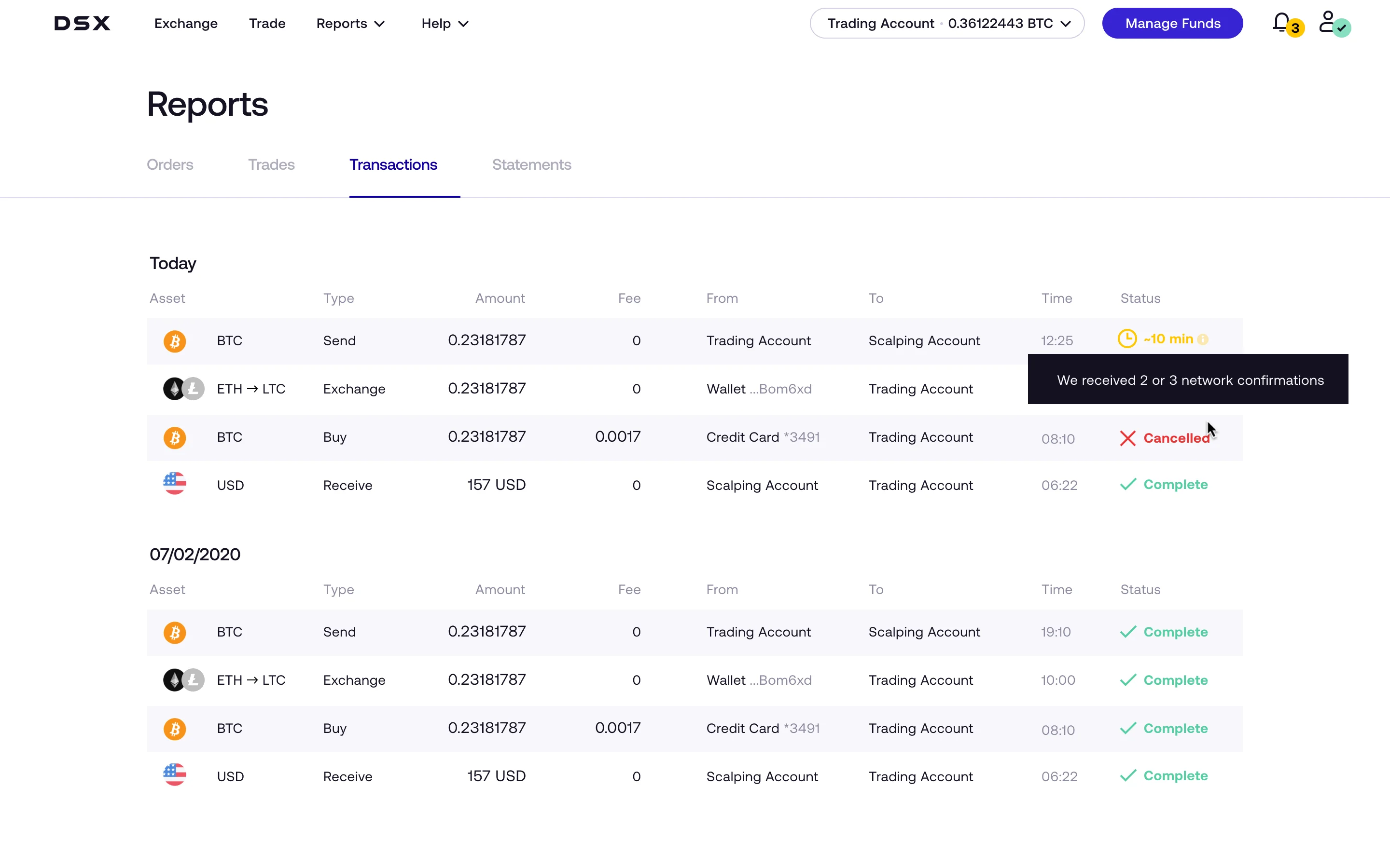
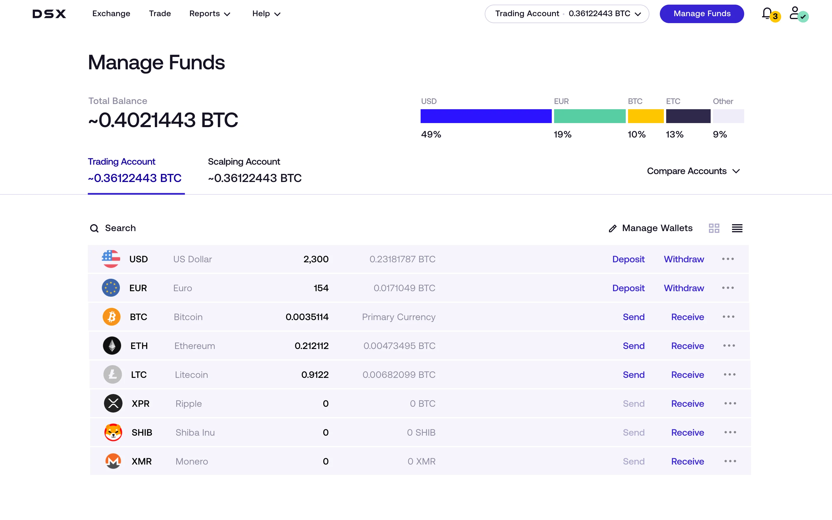
DSX Crypto Exchange — redesigning the core money-making flows
Clay led a full redesign of DSX, a UK crypto exchange. My focus was the Deposits area and related entry points, where friction and unclear fee visibility were causing confusion.
What I delivered:
Reworked deposit entry points and the deposit flow structure
Added clearer guidance around steps, limits, and expected outcomes
Made fees and method details more visible to reduce "hidden charges" perception
Improved consistency of UI patterns and primary actions within the Deposits section
The redesigned Deposits experience shipped to a test cohort. The client reported fewer deposit-related support tickets and an increase in weekly deposit volume during the test period.
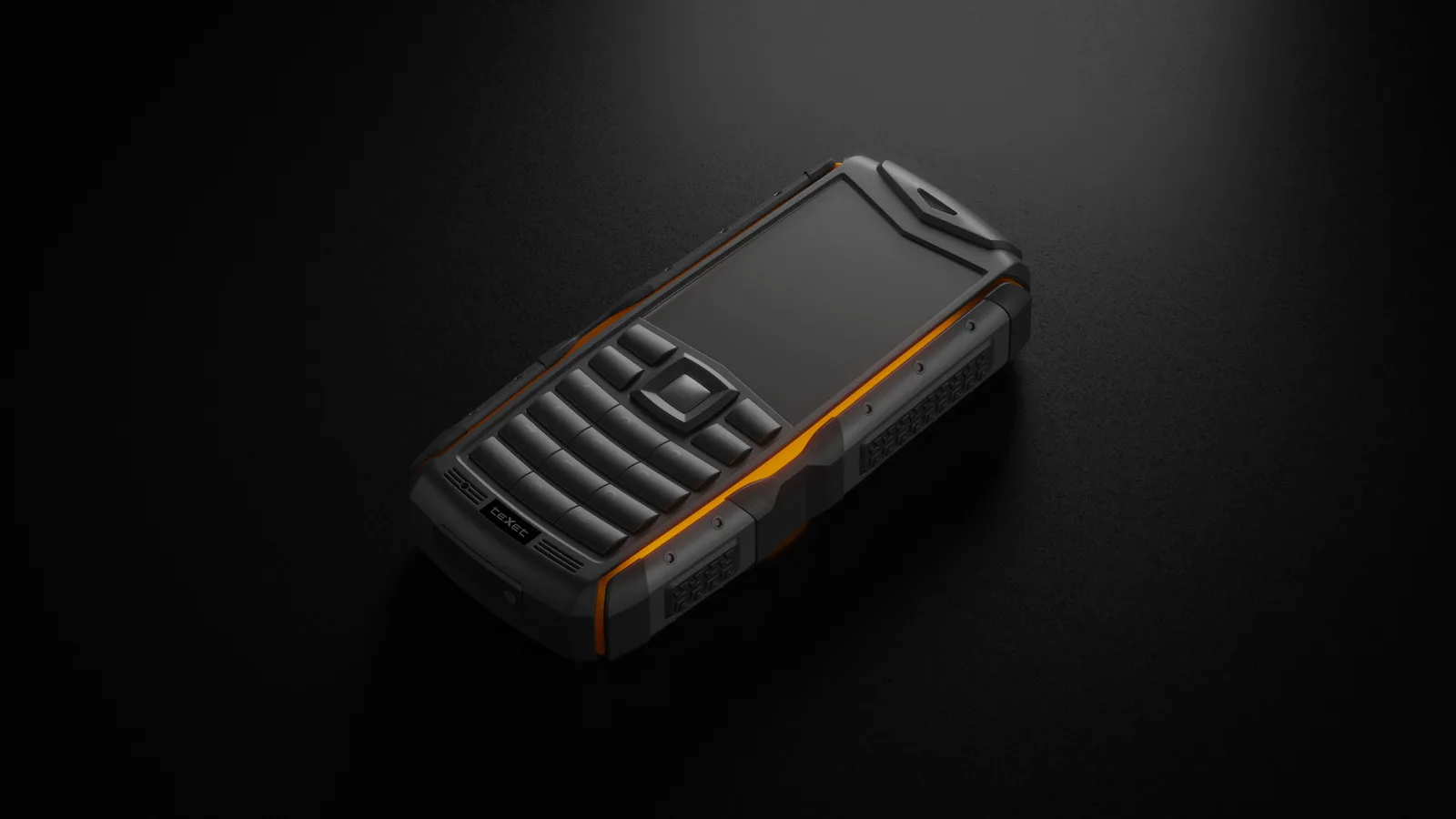
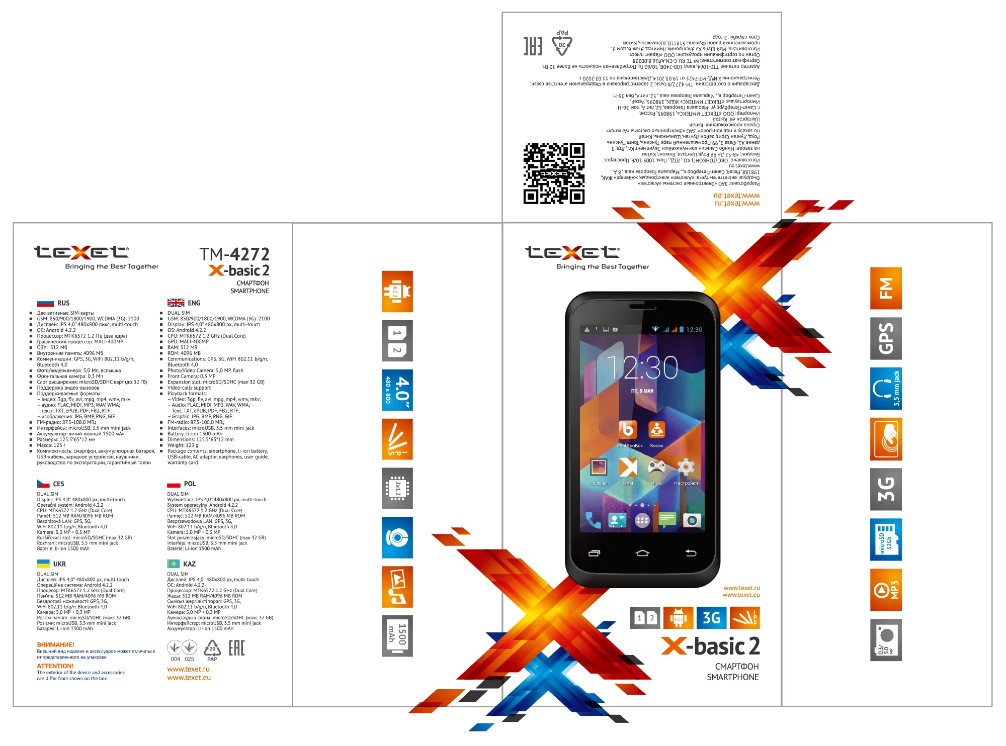
Texet (GSM / Smartphone Department) was a mass-market consumer electronics brand sold through retail chains in Russia/CIS: phones, smartphones, tablets, e-readers, and more. The market reality was brutal. Low margins, intense price competition, uneven supplier quality (hardware + software), and unforgiving customers.
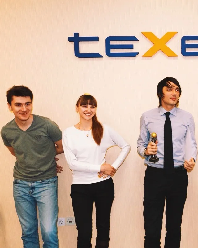
I joined teXet's new smartphone department in 2012. The goal was to run a pilot year, secure reliable partners, and scale to six-figure annual shipments.
2012–2015teXet / FlamefoxPM / Industrial Designer
I'm highlighting this project because it's one of the clearest examples of how user-centred design can drive outsized results.
My take on UCD: start from how people actually use things, find the few moments that matter most, and design around those constraints.
Rather than importing generic Chinese devices, we used low-cost Android platforms to compete in the low-end segment. The strategy was simple: don't win on specs alone. Specs are easy to copy. We competed on what earned trust and recommendations: a clear first-time experience, proper localisation, and support that helped people get started.
Strategy
Built phones for clear target groups (not "one model for everyone")
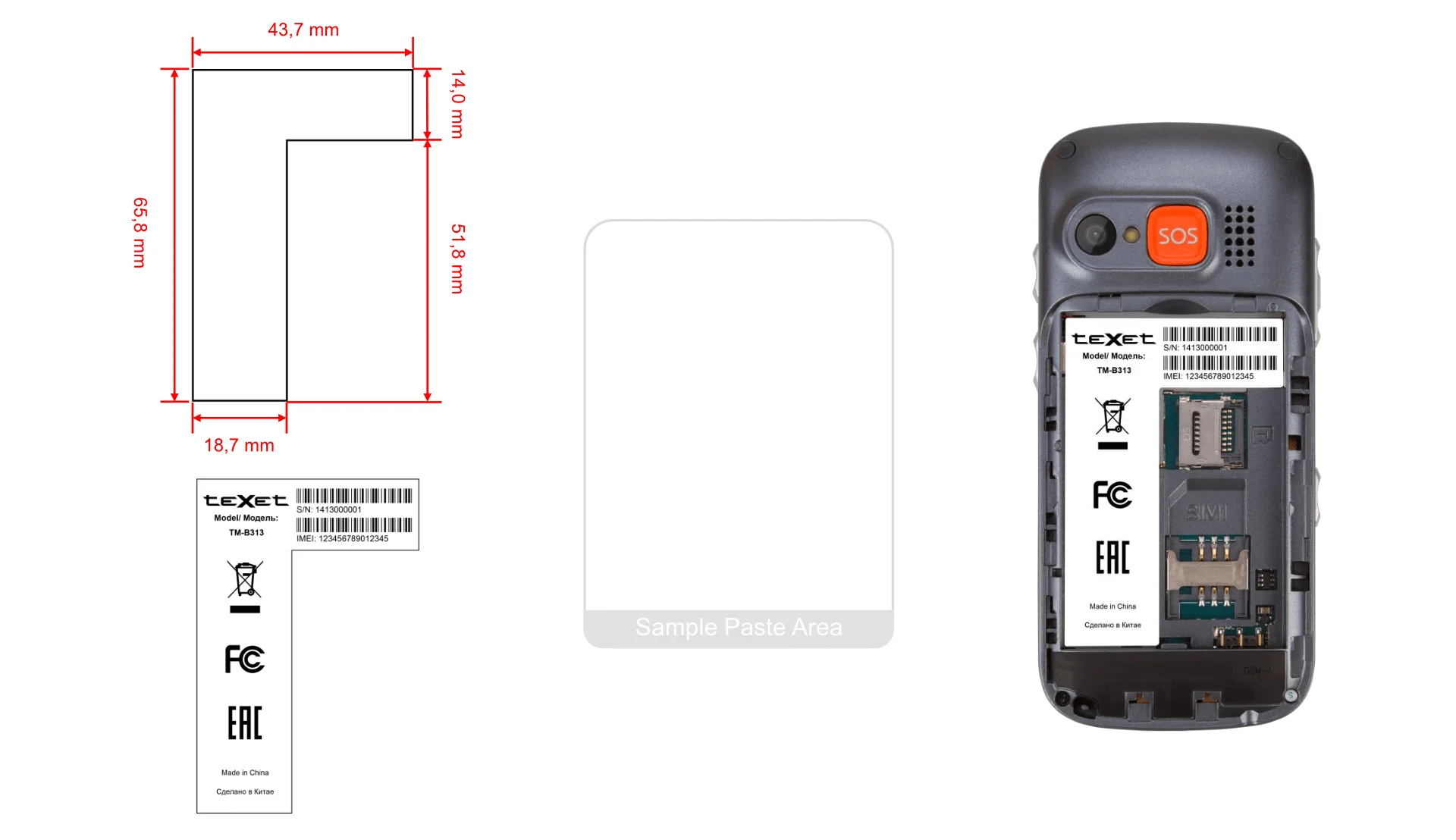
Elderly: large icons, simplified UI, SOS + family shortcut.
Rural / active: rugged devices built for durability.
Main audience: better UX + localisation, smart spec trade-offs (e.g., IPS over memory).
Mid segment: small higher-spec batches to test positioning before scaling.
Made support part of the product
Proactive support team + support page/contact form + dedicated elderly hotline.
Tracked impact via in-store questionnaires.
Enabled power users. Shared firmware/tools for flashing, experimentation, and occasional self-repair.
The combination of affordability and a reliable experience let us scale and outperform expectations in a low-end category. We scaled fast: in 2013 the GSM Department was named Best Department of the Year and shipped 514,000 units (290,000 feature phones, 224,000 smartphones), doubling unit volume vs 2012 and tripling revenue; X-basic alone reached ~300,000 units sold.
1.2M+ smartphones and feature phones sold over three years
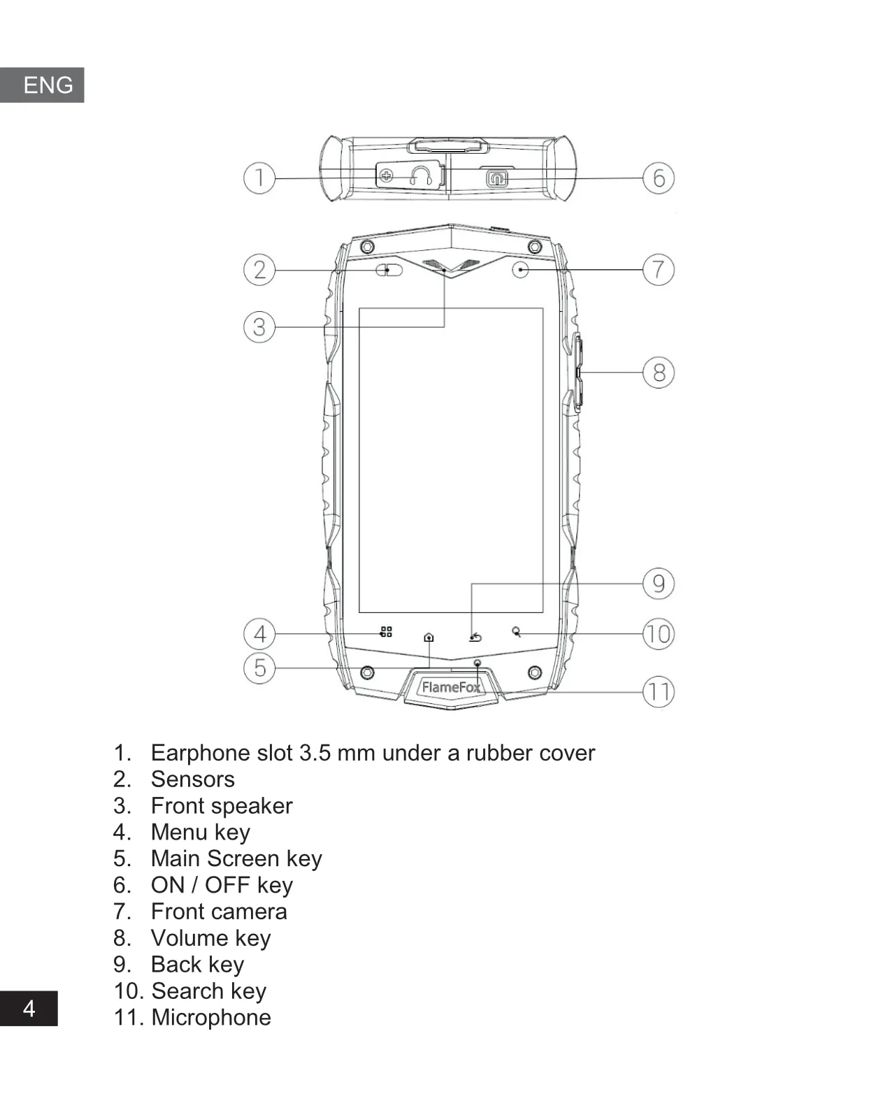
Following devices were shipped with my direct involvement, from technical and industrial design to software development and supplier coordination:
This is where my approach to design was shaped. How I think about users, how I prioritise, what I consider good enough.My department head set the standards I still follow. Most of what I rely on today comes from this experience.
Gamzat was part of my team at teXet from 2012 to 2015. He demonstrated a proactive approach to integrating user experience into the department at a time when it wasn't yet a mainstream concern. His deep understanding of Android enabled us to improve our products and deliver a richer user experience to customers. He was instrumental in the design and success of products such as the teXet X-basic and teXet X-Medium, which gained popularity in Russia and several CIS countries and achieved combined sales of 500,000 units. Through our joint efforts, we significantly raised both device standards and UX standards in the market.
Aleksei Riazantsev, Head of Product at Flame Group SE
Where to focus design while searching for product market fit?

